


Why the E-commerce Leader Won: Step-by-Step Secrets to Dominating Online Space
Great business thinking, deep understanding of the customer and aggressive growth tactics led Alza from zero to billion-dollar company, winning in highly competitive markets.


Hello there,
This case study is quite long, and it will also contain examples from other successful companies, describing their business decisions and demonstrating the customer journey step by step.
You Will Learn About:
The 4 main reasons behind Alza's success and rapid growth are predation and growth "almost" at any cost; staying at the forefront of innovation; dominating SEO, link-building & Google ads; rigorous optimization, testing, attention to every detail, and seamless customer journey.
How to create a customer journey that truly understands the customer-product architecture is broken down into 16 parts and explained using behavioral sciences
Understand and rank your customers based on contextual subconscious behavior, not just demographics or personality
The breakdown of different parts of the brain and their impact on individual interventions in product architecture
How to create a seamless connection between the online and offline worlds
The correct application of behavioral sciences in business
And much more.
More than 4 years ago, I decided to write this case study, where I looked largely purely at the behavioral aspect and customer experience of the Alza e-commerce business - the most dominant and fastest-growing e-commerce business in Slovakia and the Czech Republic, expanding to other European countries - fast.
„ In a world of great competition, a product or service must become an experience, functionality is no longer enough.“
The reason and motivation for writing this case study?
There were several reasons.
At the time, I was fascinated by behavioral economics and consumer psychology, and I was frustrated by how most of the examples in behavioral economics and books by people like Dan Ariely are vague, not at all practical, and difficult to apply to the real complex world, especially for ordinary people.
Together, there are around 70 thousand e-commerce companies in the Czech Republic and Slovakia, and the Czech Republic is even one of the e-shop superpowers. So the competition was huge, and to win, you need every advantage you can get.

Alza, once a not-so-well-known e-commerce, has gained absolute market dominance in the Czech Republic and Slovakia and has become the number one, and it is worth asking, why and actually how.
After I started shopping there regularly and reading dozens of books about humans and their subconscious decision-making, I noticed that Alza uses an incredible number of these principles and does it better than anyone else, gaining an absolute advantage.
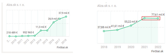
(These are just revenues for one country since by law it is freely available in Slovakia - in the Czech Republic, Alza's revenues for 2022 were almost 2 billion)
I wanted to know more about it and found that not a single article had been written on the subject. I decided to write down my findings and publish them on the Internet to find out if I was completely wrong or hit the nail on the head. The analysis turned out to be longer than I expected. After finishing it, I found a group of marketers and with a small soul, I asked if anyone would like to look at it and give feedback.
More than 70 people wrote to me right away, the feedback was incredibly positive and it turned out that I was largely right about the discovered knowledge, as well as the lack of such content on the internet.
This analysis boosted my career because at the time I was subsequently doing paid behavioral e-commerce analysis, which I later gave up to work at Exponea (Bloomreach), where I got thanks to this case study. It was also made into Exponea as a campaign and e-book, making it one of the most successful campaigns at the time in Exponea’s history.
Why am I boring you with all this?
This analysis launched my career in a big way, paving the way for me to find something that fulfills me. It helped and still helps a lot of people who work in e-commerce and don't have the budget for agencies or top consultants. And most of all, I enjoyed writing it.
Since then, this analysis has still been lying in the back of my head, I wanted to move it somewhere online, not solely focusing on the behavior aspect but in a more comprehensive way, from a product or venture building POV. That’s why I re-wrote it, found the platform Substack, and decided to start my own blog.
Is there anything else, and what to expect?
I went back to the analysis, edited some sections, reworked others, and especially added a whole new first part that will be briefly devoted to Alza from a business and product POV, then after, we’ll talk about customer experience & customer journey through the eyes of customers themselves.
I ended it all by addressing Alza's current problems related to rapid growth and reflecting on what I think they should improve in the future, hence the problem with the stagnating revenues.
1. „Straight to the top, never goin’ down don’t wait for the drop”
The quote "Straight to the top, never goin' down don't wait for the drop", from rapper Connor Price from the song Drop (which is an absolute banger IMHO), best describes Alza’s journey.
They must have played this song in Alza HQ in their early days, because the way they started to dominate such difficult markets as e-commerce in consumer electronics – and later in everything, with all the many existing players, is remarkable.
There are many explanations for how they did it, but the ones I want to point out are the predation and growth "almost" at any cost; staying at the forefront of innovation; dominating SEO, link-building & Google ads; rigorous optimization, testing, attention to every detail and seamless customer journey.
Of course, it is important to point out the first thing that Alza does well, and that is the effort to build all possible systems in-house. In fact, they were one of the very few large e-commerce companies that did not use the Exponea platform for data analytics in our country. This ensures Alza has much greater freedom in decision-making and application of interventions than e-shops normally have, never the less, you can still get inspired a lot.
I'm going to praise Alza enough, but every coin has two sides, so let's look at the darker side first.
Predation And Growth At "Almost" Any Price

I especially like the title Alza also won the 10th court trial.
A long time ago when I was still in college, my law professor told me a sentence I still remember to this day, I recall it in my head very often, and it is perfectly suited to these activities.
He said to me: "Always remember, you can break the spirit of the law, but not the law".
Something that Alza does very well: walking on the edge of the law. First of all, we have to realize that people in Alza know very well what they are doing, they study all the laws, and rules, and try to find any loopholes that could give them an advantage. That is the reason why they get fines and are in court so much, and winning them, of course.
Whether you like it or not, too many successful companies used this tactic, and still do, to this day. Not many analyses want to talk about it, but it is for sure an important lesson. Not only understand the market from consumer behavior but also from the legal side, and use it to your advantage – although, only if you have the stomach for it, otherwise it can blow up to your face pretty badly.
Additionally, they consider this factor, and even if they happen to incur the fine, it is likely to be outweighed by the profits they generate or even the expenses they would have otherwise incurred for marketing efforts.
Alza is regularly criticized and sometimes does things that are on the edge of the law, but at the end of the day, the only thing the company violates the most, as my law professor already said, is the spirit of the law, not the law itself. Everywhere we learn only about the ethical things that companies do during growth, but no one talks about those on the edge of ethics, and at the end of the day, too many players do them.

Here are just a few:
They establish exclusive "pick up" zones or drive-thru facilities for goods throughout holidays, ensuring legal compliance by distributing products instead of selling them outright. This approach allows customers to make legal purchases online, and within a mere 5 minutes, they can conveniently retrieve their items from the physical location. Employees at Alza “really understand” the significance of peaceful holidays. The company's pioneering initiative in this practice set them apart as the first and only ones to adopt it during their early days.
They employed aggressive price reductions, a strategy reminiscent of Amazon's tactics. Occasionally, they significantly lowered prices on trendy items, making it impossible for competitors to keep up. This approach might have proven fatal for some smaller businesses, forcing them to shut down.
They hiked prices before offering substantial discounts, creating the illusion of significant savings for customers, even though the actual reduction was minimal. This psychological tactic influenced customers' subconscious minds. In response, the Czech Republic enacted a new law mandating that product labels must disclose the item's price history for the past 12 months to enhance transparency and protect consumers.
They acquired elusive and highly coveted products, such as the PlayStation 5, from competitors, ensuring they were the exclusive sellers. This strategic move bolstered their popularity as the sole providers of these in-demand items.
They selected a mascot with a grating, irritating voice and relentlessly featured him on television, despite the annoyance it caused to everyone. However, this persistence ensured that people talked about the mascot, making Alza memorable in people's minds in the process, whether in a positive light or not.
Mocking competitors in advertisements
Destroying the value and power of "Black Friday" or other holidays by launching discount campaigns weeks ahead of everyone, thus devaluing the holiday for other e-shops as well. They are breaking the holiday spirits here, and not only the law’s spirit
Disclaimer: This is purely speculation and may not be based on truth. Please don't sue me.
Many companies would not be able to do such things because it would have a very negative, even existential, impact. Then why can Alza do it despite people's complaints?
First of all, people in the company understand the mindset and needs of their customers.
I deliberately used the word mindset of their customer rather than understanding their customers. People should not only be classified by who they are but by their mindset and behavior towards certain things.
The same person can go to church to pray and later yell at someone who insulted his wife. Or go buy groceries at a discount and then pay for the heated seats at a premium price because that's the car he always wanted. Still the same guy by demographic classifications.
If we look at it from a high level, people go to Alza to buy products from other brands, and it is primarily those brands’ responsibility to understand their customers and build a positive brand.
Alza is an intermediary of consumer goods, where at the end of the day you need the store to meet "simple and shallow" requirements, such as:
"I want it as fast as possible, preferably right away, anytime I think of it"
"I want it as cheap as possible and to get the best deal possible"
"I want to receive it as easily as possible"
"I just want to feel that I have done something for nature, but only if it doesn't limit me in anything else"
Many people, especially in Central and Eastern Europe, but also all over the world, “forget very quickly” if a company does something bad, or just pretend that they care about the environment and still purchase fast fashion or care about the company’s responsible behavior and still buy phones from Apple if it is advantageous for them.
If you position yourself as the middle man doing everything for people to get them the best deals, they do not focus on your other actions too much, because, at the end of the day, you come there to buy a Lenovo laptop which has nothing but positive brand associations, so why should you care about Alza too deeply?
Customers can complain that they are open on holidays, but if their microwave accidentally breaks, suddenly Alza is the savior, because why should I wait, it is open anyway.
Second, and most importantly, growth is only great if you can keep the customer or manage the operations. In the sphere in which I operate – the startup world, there are countless businesses, startups, or products whose founders and investors want the fastest possible growth resulting in bad outcomes due to mismanagement, either on the side of processes or products.
Like one of our other famous companies Dedoles, which could not handle the growth.

Alza's purchasing processes were already extremely well thought out and worked. People in the company knew that once customers came to their store, there was very little chance of switching to competitors.
According to research conducted by Exponea (now Bloomreach), the cost of retaining a customer (eng. retention rate) is on average 500% lower than the cost of acquiring a new customer (acquisition cost). This enabled Alza to allocate a much larger budget to acquisition marketing.
These few fundamental things, especially a great customer journey – which we will go through at length, correct brand positioning, clever marketing, and regulatory understanding, gave them the green light to start aggressive growth at "almost" any price.
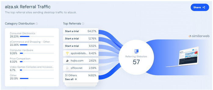
As you can see, this strategy works very well because 56% of people came to Alza from the direct marketing channel and 20% from organic search. Altogether, over 80% of people come from channels for which Alza does not pay directly.

Far more than any other competitors, same with website traffic:

Stay At The Forefront Of Innovation
Now on a more positive note. If any innovation, new solution, or service came to the e-commerce world, and customers showed interest, Alza’s willingness for fast adoption combined with seamless integration was another great ingredient to their meal of success.
Here are some of them, but I won't go into detail because that would be an analysis in and of itself:
Alza loyalty program for collecting points
The possibility of postponing payments and purchasing in installments
Alza business – portal exclusively for companies
Creation of a separate bazaar with used items on their home page
Alza NEO: electronics rental
Social shopping – buy it with your friends or random people to have it cheaper
Ability to buy unpacked but inspected goods for significantly less right next to new ones with information on their length of usage
Alzaplus+: monthly and annual membership for which you get free shipping
Alza buy now pay later option combined with paying on installments
And many others.
They were among the pioneers in introducing most of the innovations. Every intervention or innovation they implemented aimed to eliminate any reasons for customers to consider shopping elsewhere, regardless of the circumstances. This approach directly enhanced the customer's lifetime value (LTV), signifying the customer's value throughout the entire duration of their relationship with the company.
At the same time, Alza has also created something like its own ecosystem - or one-stop shop, where people can get everything no matter the situation they are in.
Undoubtedly, they followed in the footsteps of industry giants like Amazon and Tesco by introducing their own line of products, a trend observed in various companies. These Alza-branded products were likely curated using customer preference data as a guiding factor.
Amazon initially optimized third-party products and incorporated items in high demand from small suppliers into its inventory, ensuring faster delivery. Eventually, Amazon started selling these products directly. Tesco also adopted a similar strategy by offering their most popular products under their own brand. This approach highlights an innovative and effective utilization of data in their business operations. So not a surprise there that Alza followed in their footsteps.
Because who has better data than Alza?
Alza too has the ability to see the product people have the most interest in, the volumes, the prices, and calculate whether it makes sense to offer it under its own brand. It's not complicated, but it's not easy to execute at all.

There are different ways to do this and here are a few of them:
You approach the manufacturer of the products in question and negotiate a deal where they make slight modifications to the product and place your brand on it. Despite it being less advantageous than selling your own product, it remains more profitable than not having any product at all.
You strike a licensing agreement with a reputable manufacturer for a specific core technology, even though you handle the product assembly internally.
Or consider forming a partnership with a smaller, high-quality brand, or potentially acquiring it
For Alza it is a great way to improve margins and complement the ecosystem.
Dominate SEO, Link-building & Google Ads
SEO nowadays is an essential part of any marketing & long-term growth strategy. Not surprisingly, Alza executed SEO & Google ads on a much better level than the competition.
Alza has 57 referring websites in total and other competition only 20 and 13 respectively.
I see the importance of pointing this out because most businesses try to optimize SEO and completely forget about link building.
Advice: Try to build partnerships, write in various contests or comparisons, start collaborations, reach out to different media, or simply start writing content for others with a link to your page at the end of the article.
Many blogs and content creators would eagerly welcome high-quality content if it were offered to them. Yet, what I frequently observe is a limited number of individuals willing to take on this responsibility. Crafting top-notch content can be demanding and might not yield instant outcomes, deterring many from the effort. Moreover, some individuals choose not to create content for others, opting instead to feature it exclusively on their own platforms - a big mistake. These nuanced differences distinguish between the ordinary and the outstanding.
It's essential to note that Alza utilizes a staggering total of 16.2 thousand keywords, whereas its second and third competitors use 8.2 thousand and 4.8 thousand keywords respectively. The disparity is significant, with Alza enjoying nearly 60% organic "traffic," a substantial lead over the competition.

It can be seen again how the people at Alza think long-term and building SEO is starting to bring them the desired fruit.
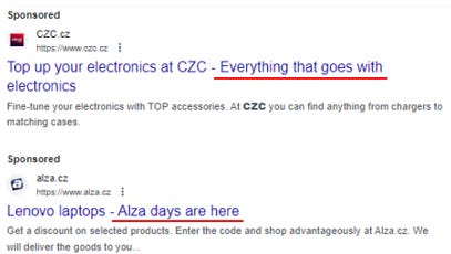
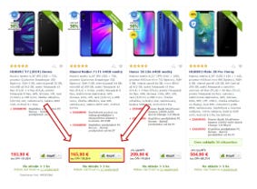
I am equally impressed by the intricate details in Alza's Google ads, which surpass those of some competitors, so let’s also look at them. If I google any laptop, for example, Lenovo, this happens:

Alza absolutely dominates, in both paid & organic search. Only the company that manufactures those laptops is ahead in organic.
Another thing I want to point out is the strategy of sponsored posts:

When searching for competition, about half of them had these additional link sections in their promotions, and among those, Alza still did it the best way.
In the first section, they place their ongoing promotion, directly connected to the slogan they have at the beginning, on the top spot.

These promotions are usually discounts that create a sense of urgency among people because the offers are temporary. It's either a discount or a promotion that triggers emotions of excitement and curiosity.
For instance, let’s look at the phrase below the headline "Use the discount code today". There is a huge chance of misreading it, especially for “simpler” people, which can subconsciously evoke the idea that it's valid only for today, urging people to take action. All of this is done without actually misleading people. This is called thoughtful copywriting.

In the second paragraph, they communicate the availability of branches everywhere, triggering the availability bias subconsciously. This bias suggests that the more available something is, the more valuable it is to us. Be careful: this applies to consumable, general items, not rare ones.

And at the end, they showcase a service, presumably the one they either want to promote more or the one people are most interested in. Simultaneously, it communicates that if you don't have the money, you can always rent that particular item. This significantly increases the accessibility of these products in people's minds.
Similarly, I see only a few companies dynamically utilizing the second half of the headline in all types of searches.
Usually, companies have their slogans or something permanent there, which is a waste of good space, especially for brands that people know.
On the contrary, I found a competitor who also has it quite good, Nay. One of the largest in our country.
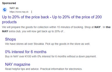
I want to highlight a particular aspect that could serve as inspiration for everyone, and talk about Nay magazine, which is at the bottom. I believe Nay could greatly benefit from a change in the approach similar to Alza, which we will mention in length later on. Rather than focusing solely on the magazine, the emphasis should shift towards establishing the brand positioning as an "expert authority" rather than just a source for the latest technological news. Although the latter might initially attract clicks and broaden the reach, it doesn't maximize the conversion potential, especially in long term. Moreover, adopting this approach puts the company in direct competition with numerous trendy tech blogs for young people, which might not be the most strategic path forward.
Advice? Play on your strengths aligned with your core business.
A very effective strategy is becoming an expert in your field that people turn to by creatively simplifying their choices. You can achieve it by creating interactive content on boring topics or issues people have, like when choosing a particular product. It could be done through videos, articles, or infographics.
A good example is the company Casper, which quickly grew into one of the largest mattress-selling companies. They use nice graphics to show how big mattresses are approximately, giving people a clearer idea.

Rigorous Optimization, Testing, And Attention To Every Detail
I thought of a good quote and modified it slightly.
„If devil is in the details, then Alza runs the hell!“
Another reason why I chose this company is its focus on every detail in the user interface. It's something I also strive to do when building products or analyzing e-commerce — focusing on every detail that might only slightly enhance the particular experience but, in the overall context, offers a completely different level of satisfaction. I will be delving into these details in the next several pages of the article.
Step by step, in this analysis, we will go through the process of a real purchase of the product in their store. By pointing out and describing specific examples of strategies and insights, enriched with examples from other e-commerce businesses, you will learn how and why these strategies work.
“It’s the little things that make the big things possible. Only close attention to the fine details of any operation makes the operation first class." – J. Willard Marriott
Are you ready? Let's get started.
2. In-depth Analysis Of The Customer Journey
In this chapter, I will guide you through the shopping process on Alza's online store (referred to as "our" online store). These insights will show you how to influence your customers' choices while making them feel in control.
Some of these interventions will be supported by examples from other highly successful e-commerce companies, demonstrating alternative creative ways to apply these behavioral insights.
Here's our scenario:
Imagine you've decided to buy a mobile phone. You'll go through the purchasing process in the following steps: from the initial visit and product browsing to decision-making, leading up to the significant purchase and the actual pickup at the physical store.
Throughout the customer journey, we will analyze the strategies Alza’s online store uses to "guide" you toward a purchase, explaining how and why they work.
Let's go shopping.
Understand And Rank Your Customers Based On Contextual Subconscious Behavior, Not Just Who They Are
People everywhere are currently learning to identify and understand their customers, whether through demographic or psychographic segmentation. I would also like to show another type of inclusion that I sometimes use, have seen the top companies use it, but no one talks about it.
a) Belonging & Unique
This phenomenon is called either slang "flake and whirlwind" or normally belonging and unique.
We humans are very strange creatures, we have a paradoxical need to stand out and fit in at the same time. If we don't feel especially unique, we get depressed. At the same time, if we don't feel part of the group, we get depressed.
For that reason, it is necessary to know where the customers belong on this scale in your business and set things accordingly.
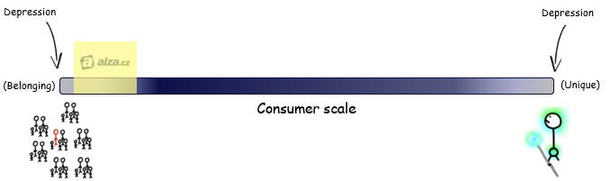
Alza's customers mostly buy cheaper and general consumer goods, where they need to generally feel that other people are also interested in them, this communicates quality since consumer good is not something you take to the public to brag about. In that case, the e-shop page should look busy, have “organized chaos”, and have lots of different incentives.

Hmm, check.
Basically, they should try to subconsciously create a feeling as if people are in the marketplace, like in the old days.

On the contrary, if we were to sell luxury products, we need to reduce incentives, less content, and more "white spacing", i.e. the gap between products.
b) Cognitive Scale
The brain is designed to conserve energy and preserve our cognitive resources. That's why all companies invest huge sums in reducing friction (such as UX/UI design). They aim to provide you with what you want in the simplest way possible. However, there is one exception to this.
It's not true that we only want to minimize cognitive effort or conserve cognitive resources. We want to use our cognitive resources (brain capacity, performance, memory) for things that interest us and save them for what doesn't. For instance, someone passionate about electronics might spend hours assembling computers or selecting accessories.
On the other hand, people less interested in electronics want to quickly find what they came for in a particular online store. Therefore, we must determine where the customer likely falls on this scale and adjust our approach to service creation accordingly.

That's why I would classify Alza like this. Most of the customers do not have extra enthusiasm for the given thing and rather just need it and want to choose the best one. Therefore, many options, informative text, description, easily communicated advantages, and easy accessibility are the way to go.
However, there are a few people who enjoy this kind of shopping and they also need options such as very detailed descriptions, structured technical information, or comparators.
c) Personas In E-commerce
Every store attracts at least one of the customer types I describe below. For larger visits, these are the most prevalent categories you encounter. It's crucial to acknowledge and cater to these customer types, enhancing the overall customer experience and optimizing the customer journey for each one of them.

Impatient Isac: Easily frustrated and not afraid to speak their mind
Researcher Rick: Thoroughly researches every aspect of a product via the web and speaking to sales staff, reacting slowly to new products
Lost Diamond Lisa: High-value lapsed purchaser
Single Scarlet: Could use any channel
Suggestible Sia: Your dream customer
Showroom Seneca: Kind of window shopping
Returning Rita: Picky shopper with a high volume of purchases AND a high volume of returns
Discount Daisy: It’s all about the thrill of bagging a bargain
Alza addresses everyone, and so should everyone who operates in the digital/e-commerce world.
Homepage Tailored To Different Markets
Welcome. You have just landed on the home page of the e-shop. Your search engine most likely brought you to an e-commerce site in your home country.
Since the seller has representation in different countries, you can choose which country you want to deliver to. The home page for other markets is different from the usual e-shop home page in countries where Alza is #1. This is another differentiating factor from other companies who usually have the same landing pages for each country, just different localizations.
Its main element: customer reviews & carousel.
Alza UK has a carousel about special offers, new products & reviews below:

Alza Slovakia has a share and save carousel & product listing:

When entering a new market, most e-commerce websites make minor adjustments. However, Alza has adapted each entry page specifically to the audience of the given country.
The e-shop is well-known in its home country and its marketing reflects this. On the other hand, in countries where e-shop is not yet popular, they wanted to create a sense of trustworthiness and demonstrate credibility. These are, for example, banners on the side pages.

From behavioral insights, what Alza UK is doing, we recognize this principle as social validation. It states that when deciding what is right, people turn to others to determine what they consider correct. The more you see others doing something, the more you perceive it as the right behavior because your brain assumes they might know more about the situation.
In the case of an online store, the more reviews you read from companies or brands you trust, the higher the likelihood that you trust the store for making a purchase.
For example, the company Casper, which sells mattresses and grew from $0 to $750 million in 4 years, employs three levels of social validation right on their first page. First, they present written customer reviews, including the person's name, location, and rating of Casper.

(Casper is 100% transparent here. If you click "See All Reviews" you can read everything customers have to say about them, including dissatisfied ones.)
Below their customer reviews, you can read tweets from customers, which further adds to the legitimacy of their reviews.

Finally, Casper adds a third layering of social approval: media badges and press releases.

Brilliant. But let's go back to our e-shop.
In the end, I decided to keep shopping, selecting "Mobile phones" from the menu.
How To Execute Social Approval
When it comes to customer testimonials, online stores face two main challenges:
Gathering as many rich and insightful reviews as possible; and
Convincing their customers to make a purchase using by cultivating the reviews in the best possible way.
The way you request references can have a significant impact on the quantity and quality of the collected reviews.
Even if you manage to persuade your customers to leave their feedback or reviews, they are usually too vague and general.
Casper found an intelligent solution to this common problem. A few days after you become a customer, the company sends you this email requesting feedback or a review:

After clicking on the CTA button, in this case, review the sheets, you will be taken to a page where you can submit the following form and leave a review:
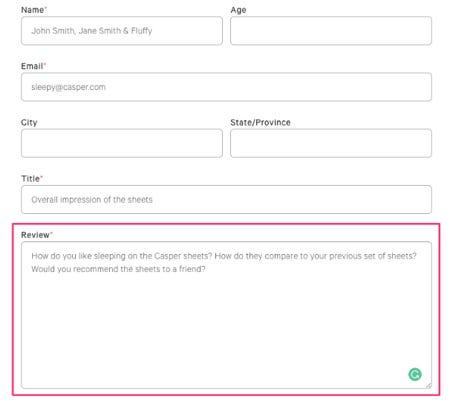
Casper prompts you to answer some specific questions and leaves no option to write anything. This way, it is easier for customers to fill out the form.
Plus, they get richer and more meaningful product reviews, such as:

How you display your reviews is just as important as collecting them.
You can display your customer reviews in multiple channels: Use them in your emails, on your product pages, in paid ads, and more.
Get inspired by Casper again. They display customer reviews on a dedicated page...

... and use them in email marketing as social proof:

How to create carousels
Carousel is a scrolling banner format that is usually found on the main page of your e-shop. An example of a carousel would be a rotating carousel that displays products or photos.
Our recommendation? Avoid using carousels altogether because when used incorrectly, they can do more harm than good. However, if you must use them, there are a few things to be mindful of.
Remember, your customer has limited time and cognitive resources they're willing to spend on your website. Your goal should be to ensure that the customer sees as much as possible from your site in a very short amount of time.
One problem can arise with the automatic scrolling of carousels, especially if they move too quickly or too slowly. This means customers won't have enough time to comprehend the information or may not have the patience to wait for all of it.
The University of Notre Dame tested their carousel. The following table shows the results of their test. Only 1% of the total visitors clicked through the carousel, and the majority of them (84%) interacted only with the first slide of the carousel.

So what are the main conditions that you should follow so that the carousel works for you and does not harm you?
Small size: Ensure they don't take up a significant portion of the top section of the landing page.
Communicate the number: Show people how many banners you have (either through a list, numbers, or dots). Most online stores only have arrows, which can create uncertainty in people because they don't know how many images will follow, causing them to move on.
Provide valuable information, don't sell: While you're trying to sell throughout your online store, don't use carousels for that purpose. They activate "banner blindness" in people, where they actively ignore ads. Instead, provide valuable information about the site or share updates.
Communicate what to expect: Probably the best advice is to display a list of benefits that the carousel communicates somewhere on the side (see the image below).
Alza adheres to all these rules very well, where basically the list in carousel is in translation:
Share and save
Martian (their mascot) shopping
Father’s deserve the best
Subscribe for news and discounts

Browsing Products And Categories
In the section with the offer of mobile phones, the e-shop organizes the content deliberately in such a way as to influence your decision.

Let's look at each part in more detail.
1) Night Drive-thru
The first thing you'll notice on the left panel is the message: "Night-time pickup is available in your region.", so you can pick up your product for a higher price even during the night. This strategy works due to a combination of cognitive biases called availability bias and hyperbolic discounting.
Availability bias – The human brain tends to overweigh the value of a fact, idea or object when it is easily available. We tend to overemphasize and overestimate the importance of information that is the most available.
Availability bias, a very popular and powerful bias, It's something Coca-Cola has long grasped, and companies like Uber, Airbnb, and Amazon are trying to use it to their advantage through massive expansion - by basically being everywhere, creating something similar to the network effect.
Night delivery subconsciously gives us inner peace because it assures us that if we need anything at any time, we can get it, NOW. It does not matter that you are unlikely to use the service, ever, on a subconscious level you are glad and appreciate Alza such an option.
Hence, Amazon prioritizes rapid package delivery, emphasizing the importance of speed and availability, which has often more significance than perceived.
For example, Tesco in Bratislava faced significant resistance when they chose to shut down all non-stop operations. Despite minimal usage, people protested this move, highlighting the value of the freedom it represented to them.
The concept of free delivery is widespread in e-commerce, but Alza took a bold step ahead of its competitors by introducing night delivery, setting a new standard in the industry, the same as Amazon did with 1 or same-day delivery.
Second bias, hyperbolic discounting explains people's tendency to choose smaller immediate rewards over larger, delayed ones.
For your online store, this means you should always offer quick delivery options, even if the costs are higher. This attracts more people to make a purchase right away, encouraging them to make faster decisions.
Offering "nighttime pickup" – the option to pick up the purchase as soon as it's available – is another way to achieve this.
As an example, if a customer buys your product immediately, a time-limited offer of free next-day delivery has a similar effect to the availability of night-time pickup.
2) Blockbusters Of The Month Strategy
At the top of the product list, irregularly Alza places the hottest (cheapest) product for a particular month or week.
Blockbusters of the month or week are good product marketing strategies when you need to clear your inventories.
This typically involves short-term showcases where the online store has negotiated with the seller to reduce the price for a limited time: a day or a week. Then the price returns to normal.

The aim of this strategy is to compel people who take a long time to decide on products to make a purchase now. It's rooted in a heuristic called scarcity, which states that people tend to attach greater value or attention to objects with limited availability and with FOMO (fear of missing out). This is the feeling our online store triggers in your brain by showing you a limited offer of proposed mobile phones.
Moreover, it can help increase the retention rate. People don't want to miss out on a great deal; they want to get the best offers. It's also a quite significant motivation for customers to regularly visit your online store to see if such an event is not happening again.
Similar to what PlayStation is doing:

3) Educating Customers With SEO And Their Hearts
One of the best ways to increase satisfaction and improve the experience of your customers is to provide value above and beyond and facilitate their decision-making. Our e-shop does it very well.
When you get to the bottom of the page, you'll notice a menu with different options to explore. The last three of these options are educational sites:
• Why buy a mobile phone from us?
• How to backup and restore data
• How to choose a mobile phone
(Sorry the picture was only in my language but you’ll understand it from the text)

The first page that educates introduces the benefits of shopping on this online store. The second one adds value by telling you how you can back up data on your old phone and restore it on your new mobile device. Something you might have been concerned about before, but not anymore, right?
The third page is probably the most helpful: it provides detailed instructions on how to choose a mobile phone. There, you'll learn what to look for based on how you intend to use the smartphone, as well as who you are, such as a manager or a creative professional. The page guides you through various categories and frequently asked questions. If you didn't know where to start before, you should now.
This also changes based on the current issues people are facing with the particular products. See what they did for laptops:
Furthermore, creating educational pages can help boost your online store's SEO because Google ranks your pages higher when you publish relevant and unique educational content. This means people searching for product reviews or user guides may end up on your online store's webpage. When you provide them advice, in our case – offering phone buying tips – they have the opportunity to immediately check the offers and reward your help with a purchase as a token of appreciation. It's simple, and it works.
It is also one of the reasons why I am conducting this case study, you hopefully get a lot of value from this content and I am primarily looking to strengthen my name as a brand, industry relevance/recognition, and the opportunity to work for world-class startups - if the content is good of course, in return. It's said that a win-win scenario doesn't exist, which, from our perspective, is untrue. Offering value, whether in the form of content or service, is essential.
The behavioral principle explaining why this works is one of the strongest of all: the principle of reciprocity.
Reciprocation – We are wired to reciprocate. If people give to us, we feel we owe the other person. Similar to the fairness tendency, if someone hurts us, we feel the need to hurt them back.
When someone gives you a gift, you might feel the need to reciprocate. This assertion is supported by a well-known study where waiters and waitresses managed to significantly increase their tips by 21% by giving customers one extra mint after dinner, specifically placed on the bill.
The main takeaway from this is to do something extra for your potential customers that they don't expect. For instance, guiding them during the purchase process can help convert potential customers into actual buyers.
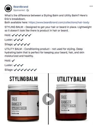
Let's consider another example, Beardbrand, a company that sells accessories for men's beards. Founder Eric Bandholz, before deciding to start the company, regularly created content for people about shaving and beard care. One day, he decided to establish the company.
Today, this online store, which Bandholz "just started" one afternoon, generates approximately 431,000 visitors per month. [Source.]

Although it might be easy to assume that a significant portion of Beardbrand's traffic comes from PR, it's not true: it comes from content. Beardbrand, after all, according to their own admission, isn't just in the business of men's grooming; they are in the education business.
"We were one of the first companies to make beard oils and invested heavily in educating the market," Bandholz explains. "It helped us stand out and grow organically."
And indeed, it did.
According to Similarweb, 90.44% of all their social conversions (10.22% of their TOTAL conversions - this number decreases as they get bigger) come solely from YouTube.
Additionally, their YouTube channel has 1.58 million subscribers and averages 61 million views over a 30-day period. [Source.]

As the Internet guru Gary Vaynerchuck pointed out long ago, every company, regardless of its focus, will have to become an equally media or educational company. They will have to educate people about what they are doing. There is no better way to increase loyalty and customer experience by literally helping or teaching people how to use the product and which product is right for them.
Now you should understand why everyone, as well as Alza, act as if they are also educational companies, and why NAY, mentioned earlier, should not be a magazine? —> Reciprocity and SEO.
Deciding Which Phone To Choose
After scrolling further, you will finally get to consider the offered products.

The tactics that our e-shop uses here can be explained by five behavioral principles that "pull" or "push" you, the customer, in a certain direction.
1. Naming And Framing Of Categories
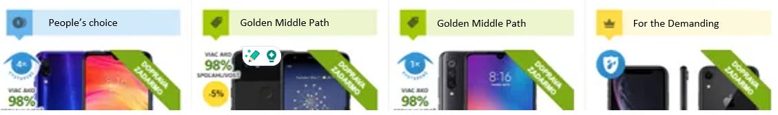
The online store displays various products in three main price categories: People’s Choice, Golden Middle Path, and For the Demanding.
One reason for this is that consumers respond to choices differently depending on how they are presented. Marketers call this strategy the framing effect. Let's look at how these three categories are framed.
The cheapest option on the left is the "People’s Choice." This arrangement cleverly avoids the potential negative connotations that cheap might evoke, and at the same time, you will feel that it is the most popular choice among people, not the cheapest, so you're indeed, shopping wisely.
Its opposite, the most expensive category, is called "For the Demanding." It challenges the high-end buyer who is willing to spend a fortune on a new gadget. Choosing the option for demanding individuals communicates to you that this product will meet your high expectations and standards.
The middle category is called the "Golden Middle Choice." Based on the well-known concept of Aristotelian philosophy, this choice represents the desirable middle ground between two extremes, one excessive and the other insufficient.
By using this tactic, the online store demonstrates that it can cater to everyone regardless of your social status. Based on the price range, you can choose the right product and feel satisfied with it.
2. Directing the customer to the middle choice
Displaying three categories is not a coincidence or a common practice.
When you present people with a variety of options, they tend to choose the middle one. This principle called the Center Stage Effect, can help you increase sales of specific products while providing the customer with a middle-ground option.
But while your brain's focus is on the middle, there are parallel sets of social and cultural norms actively subconsciously discouraging you from the extremes.
If Starbucks wanted to start selling Grande coffee, he added Venti coffee to the menu. Almost no one will buy Venti (which wasn't even the intention) but it increased the sales of Grande Coffee. That is why movie theatres offer mega/XXL popcorn in cinemas.

Bottom line: If you want to drive sales for a particular product, place it in the center.
3. Influencing Customer Judgment By Introducing Extremes
Staying within these three categories, there is yet another strategy.
If a customer is choosing between two options, you can influence their purchase decision by introducing a third option that can asymmetrically impact their decision-making - a decoy. Its purpose is to change the perception of the other two options, not to sell.
The principle I'm talking about is called the Decoy Effect.
But why does our e-shop display four products?
Let's look at the prices. The first one is $364, the two middle options are around $621, and the highest one is $999, which is almost double the middle choice.
By introducing extreme options or different additional benefits at very advantageous prices, the e-shop alters the perception of the other products and increases sales of products that bring the highest profit.
4. Let Customers Decide For Themselves
Perhaps you're wondering why there are two products with similar parameters and prices in the middle category.
One way to explain this is the concept of empowering the customer. People tend to associate their shopping experiences with the level of control they have in the process. If they feel it wasn't their decision, for example, if a salesperson pressures them or if you misuse the scarcity offer countdown, it can cause stress and consequently reduce the overall customer experience.
So, by giving your customers a choice between two very similar middle options and letting them decide, you create a better shopping experience, ultimately helping you turn a prospect into a loyal returning customer.
5. Contextualizing Products
One of the problems e-shops often face is the high number of products offered. Customers don't know which one is the "middle" choice. They lack context.
This can make your customer feel paralyzed and uncertain.
Our e-shop has decided to address this issue by initially presenting only four products, which are divided into three groups with attached prices to them. Customers thus get an "anchor" against which they can compare all other products. This behavioral principle is called anchoring.
Anchoring leads consumers to use the initial number (in our case, the price) they hear as the main reference point.
Once you see the number, you will compare everything to it, even if the number is entirely arbitrary. This way, the e-shop can influence your perception of the price, the product's value, and all your subsequent judgments or purchase decisions.
At the same time, it makes the selection process easier for you as a customer.
3. How The Choice Architecture Is Formed For Individual Products And What It Actually Represents
In times when online shopping is the new standard, there's one thing that can help you stand out from your competition: creating an experience that captivates your customers.
This is where choice architecture comes into play.
Simply put, the way you present a product influences what your customer decides to buy. You can influence people's choices by nudging them in a particular direction while making them feel like they made the decision themselves.
A "nudge" can be a feature or message that captures your customers' attention and alters their behavior.
Many studies have already shown that the strong use of some behavioral principles or cognitive biases is rather annoying for people and significantly reduces the customer experience. Therefore, if companies merely copy what others do, it usually has the opposite effect. You can see how this is not done at booking.com. (For them it works because they started with it first and already have a name and established design, but recently people started complaining about such practices)

How does this work in practice? This is how our e-shop displays product details.

There are a number of strategies and behavioral principles that steer the customer in a certain direction. So let's look at some of them in more detail.
1. Icons - Doubt-avoidance Tendency

If you have doubts about something, it can prevent you from making a decision entirely. It's the way your brain deals with uncertainty – simply by avoiding the decision.
Using icons like "More than 98% Reliability" is an excellent way to instill confidence in your customers' minds. It creates a positive opinion or impression about the product. Among other icons highlighting product benefits are: waterproof, eco-friendly, organic, etc.
Icons or badges allow you to communicate values and create asymmetric choices very quickly if you know how to use them of course, because it can also backfire.
The purpose of the icons is to provide a quick overview of the most important benefits of the product.
2. Free Delivery - Affect Heuristic/Availability Bias

By highlighting free benefits, you can create a positive response in customers' minds while browsing products.
According to a recent study, 60% of online retail sellers claim that "free shipping is the most successful marketing tool." Moreover, "unexpected costs" are the tenth main reason why people abandon their shopping carts. Travel agencies would know.
This can be explained by the availability bias and affect heuristic. Free options evoke a more positive response in the brain compared to those that come at a cost.
Availability bias – we've already talked about this when describing the advantages of night delivery, so I don't have to repeat it all again. Humans not only attach much weight to what is more affordable, but the brain is designed to save time and energy.
So if the product is delivered to your home for free and you won't move a finger, what could be better? Only when the courier delivers it to you when you are really at home 😉.
3. Rating - Social Proof

Social proof – is an automatic tendency to think and act as others around think and act.
Several years back, Google conducted a survey revealing that people make purchasing decisions based on recommendations from others. Through star ratings, Alza effectively showcases public opinions on specific products, offering valuable insights into customer sentiments.
Small advice I would give to Alza. In the future, a number could be written in small letters next to the stars to show how many people rated the product. This could significantly increase both, the product’s credibility and conversions.
4. Scale - Comparision Bias

Comparison bias – People tend to make decisions based on comparisons instead of evaluating each situation, product, or service individually. You must infer value either against something or by creating categories. Both of these cases are very dangerous and can be used to mislead human perceptions.
This comparison option is commonly used and greatly assists people in making decisions while dramatically improving customer experience.
5. Brand Name - Association

In most cases, we no longer look at the product itself, but first at the brand which made it. Even with the old architecture, this title was above the product image, but after a new update, the title is down, which I regard as a wrong step, even though I understand the role that the image plays.
So my advice is to brand the name as high as possible and first.
6. Product Name - System 1&2

The brain has two systems, as Kahneman and Tversky discovered. System 1 and System 2, and most of the time our brain works on System 1 - a system that is automatic, reactive, and connected to emotions. That is why every product needs to contain a very short description, which allows the consumer to quickly find out what it is about.
There should be at least a company name and brand with attractive and essential information.
7. Product description

As mentioned earlier, not all decisions are purely driven by emotions; logic also plays a crucial role. Therefore, engaging System 2 - logical, methodological thinking, is essential. Claiming that decisions are solely emotional is akin to saying, "I bought a computer because I liked the picture." It doesn't align with reality.
When selling a product, it's vital to appeal to the logical part of the brain by presenting essential product parameters. These details should be substantial enough to enable consumers to form a clear understanding of the product's quality and functionality.
8.&9. Free Gifts - Decoy Effect & Affect Heuristic
Decoy effect – There is a phenomenon in which consumers tend to change their preference between two options, when another option is also presented that is asymmetrically dominated.
Offering something for free can significantly influence a consumer's choice if applied strategically. For instance, when presented with a choice between a trip to Paris or Rome, individuals weigh the pros and cons. However, if you mention a complimentary breakfast in Rome, despite its minor impact, the perception and preference for Rome can disproportionately increase.
This can be supported by the affect heuristic we already talked about. Free options evoke a more positive response in the brain compared to those that come at a cost. The result is the zero-price effect, suggesting that if you give something for free, not only do you reduce the costs, but you also increase its perceived value.
But not always, you have to be careful what you offer something for free because you might trigger something called “bonus as a burden”. Some experiments have shown that providing something for free along with a product could decrease the perceived value of the gift. In some cases, it can be up to 35% less. People might ask themselves, why are they giving this away for free? Do they have too many of these items, or is it going out of style?
Here's a helpful tip: When providing complimentary incentives, specify the item's price and explain the reason for its inclusion. This approach can enhance its perceived value, leading to the desired effect mentioned earlier.
10.&16. How Many People Purchased Combined With In-stock - Social Proof & Scarcity
We've already mentioned scarcity. It's said that if a product is harder to obtain, whether due to limited time or quantity, we tend to perceive it as more valuable. E-commerce stores use this strategy to compel people to buy. Including such an icon in the product details can help urge customers to make the purchase before it's gone.
The concept of loss aversion can also assist us here. It tells us that the psychological pain people feel associated with losses is twice as strong as the pleasure of gaining something.

What does this mean for us? The mere possibility of missing out on what we want can drive people to make purchases sooner, especially when the item is important to them. Because you don't know if there are 7 or 700 items in stock. Would you prefer to take that risk and not buy it immediately when you've found what you were looking for?

A similar effect can be achieved by including the number of customers who bought the product that day or week. Other people's interest in the product enhances its perceived value. This relates to another concept mentioned earlier: social validation/proof.
11.&12. Price Display - Anchoring Bias & Contract Effect
Anchoring – Humans usually rely on the first information that we received no matter how reliable that piece of information is when we take decisions. The very first information has tremendous effect on our brain.
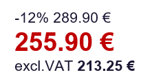
The first information has a great influence. Therefore, the first price before the discount, which is crossed out, is bigger and the current amount below is smaller. It will always work. To my surprise, Alza has chosen a different approach and immediately shows the real amount of product a person pays.
When you compare two things against each other, you can gain a distorted perception if there are one or more significant differences. This is caused by a cognitive bias called the contrast effect.
Comparison can be explicit or implicit and can relate to any features or properties, including price. For example, comparing an expensive product with a more expensive one will make the original product seem more advantageous.
In our case, presenting prices before and after, placed next to the price excluding VAT, makes the product more attractive than it actually is. The contrast effect is utilized in a much more complex manner, but for now, this explanation should suffice.
13. Campaign Highlight - Salience

Salience – (in this case, the phone) is the state or quality that stands out in some way from its neighbors. Detection of "saliency" is considered a key attention mechanism that facilitates learning and survival by allowing organisms to focus their limited perceptual and cognitive resources on the most relevant sub-sets of available sensory data.
This principle is borrowed from neuroscience. Salience, also known as perceptual salience (we could also call it "perception of noticeability"), states that people focus on more salient information and ignore less significant ones. It creates a tendency towards more striking, visible messages, usually due to the high contrast between them.
Our online shop utilizes this tactic to highlight special offers marked in yellow. These are time-limited unique offers that the shop wants to draw attention to among all others.
or even during Black Friday:

14.&15. Buy Button - Path Of Least Resistance & Friction Cost Removal

If you want to provide a truly unforgettable customer experience, you must keep things as simple and smooth as possible. That's because people always choose the path that requires the least effort. This is the principle of least effort, which relates to customer journey architecture.
This can be achieved by eliminating all possible points of friction your customers might encounter during the process. Friction points could be any additional steps your customer has to take or complex language used to describe your products. Simplicity wins over sophistication.

In the case of our online shop, returning customers have the option to choose "Express Checkout." If they've saved their details previously, they can skip several steps and get straight to a big purchase. Limiting the process to just a few clicks removes unnecessary friction and creates a better customer experience.
4. Stimulating All Parts Of The Brain - When Emotions Are Not Enough
Here is a small sample where we can look at the same architecture from a completely different perspective.
What perspective is that?
Through the lens of cognitive sciences and neuroscience. Everything you'll see now is a bit unique and let’s say, just my theory.
We first came to this analysis after trying to debunk the fact that people only shop impulsively, and make decisions subconsciously, or based on emotions. It's not entirely true.
Most people in marketing learn to appeal to human emotions. It's still important, but according to us, it's not the only and most important thing anymore. The winning company is the one that can stimulate all parts of the brain simultaneously and thus provide the best services and the "best experience."
In a condensed form, we will show you our processing of the triple brain model.

Here is a brief explanation of the utilization of individual parts of the brain using the triple evolutionary brain model:
a) Reptilian brain: Our oldest brain that complements in many ways with the Amygdala. In this case, its role is communicating with the subconscious and saving brain energy. It seeks the most efficient path, or in other words, the path of least resistance.
b) Limbic system: Responsible for emotions, feelings, and habits. This is the part you're taught to appeal to in marketing.
c) Amygdala: Our instinctive and impulsive brain. Its main task is to keep us alive and is responsible for our primitive emotions, impulsive decisions, and urges.
d) Neocortex: The newest and most advanced part of the brain. Responsible for our logical and rational thinking. Although it has the least importance in decision-making, its presence is still essential.
Below you can see my analysis of the choice architecture from the perspective of stimulating the most important parts of the brain. However, due to excessive complexity or length, we won't delve further into it. Perhaps later in the future if people show interest.

5. The Big Purchase
You have reached the most important part of the process: the big purchase. Let's see how our e-shop helps customers address their needs and concerns.
a) Utilizing Authority Through Advanced Customer Support
To learn more about a specific product, the e-shop allows you to open the product details by clicking on its image. Here's what you'll see.
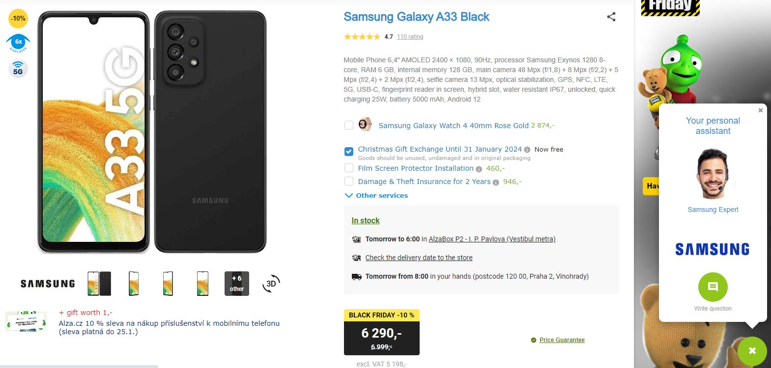
However, there is one thing worth mentioning here: the pop-up window in the right corner of the page through which you can contact us.
What makes it different from most e-shops? Depending on the phone brand you have, a window with the message "Your Personal Assistant – Xiaomi Expert" will pop up. This means you will "get" an expert for the specific brand you can chat with. This is certainly much better than what other brands use in terms of "send us a message." And yet, this change is not so challenging.

The principle of influencing by authority is applied here. It is the tendency to attribute greater weight to the opinion of an authority and be more influenced by this opinion. People have a deeply ingrained obligation to authorities from an evolutionary perspective and usually follow their instructions. So, there is an increased chance that people will contact this authority, which also increases the likelihood of purchasing the specific product if the specialist provides the right advice.
Adding a picture of the person, just making it more personal, increases in likelihood of asking for advice that significantly increases the likelihood of purchase.
b) Offering Extra Services Before Purchase
But let's continue. Let's imagine it's a phone you're interested in buying.

However, clicking on the "Add to Cart" option doesn't take you directly to the cart. The e-shop has added an additional step where you can choose extra protection for your product or additional accessories and services, such as customizing the appearance of your new mobile phone. They dedicated an entire page to this.

These additional services include warranty extension, insurance, and even phone screen protection. To make your experience even smoother, the e-shop offers software installation and initial setup to save you time for 9 euros. You won't have any worries at all. If you, as an older generation, were worried about setting up new products, suddenly this offer sounds irresistible, doesn't it?

But there's more.
As you know, every additional step your customers have to take before they get what they want increases friction and leads to lower customer satisfaction. That doesn't apply if you add a step that provides value.
In the case of our e-shop, these additional services hit the nail on the head. The accessories address what really matters to customers and demonstrate a deep understanding of their needs. Each product displays accessories tailored to the buyers' biggest uncertainties about that specific product. This appeals to the human brain's tendency to eliminate any worries with quick and impulsive decisions. It's called the doubt-avoidance tendency.
At this point, customers are likely to say "yes" to the additional service if it helps them remove their doubts about the purchase. It's an excellent way to make an upsell and enhance their overall experience.
If you believe in your products, you can even offer a "Lifetime Guarantee" and create an irresistible offer like Sunski:

When you go to the product page, the lifetime guarantee is included twice. First as an illustration below the product image...

And again in the expanded FAQ section.

Or eliminate uncertainties by finding out what customers' biggest problem with your product is, not something general like the warranty period, and either put it in the FAQ section or address it directly in your advertisement like Beardbrand:
I just wanted to show how many creative ways there are to eliminate uncertainties and make upsells at the same time.
c) Shopping Cart
In the design of the shopping cart, let's focus our attention on two interesting aspects.
Subliminal Messages Guiding You to Online Payments
During our analysis, the e-shop ran a marketing campaign for "Free Delivery." According to the rules, you get free delivery if you spend over 160 euros and enter the free code "PAYONLINE."

This tactic is called subliminal messages. It's something that conspiracy theorists really like. The free code "PAYONLINE" is a message designed to bypass the conscious mind. It appeals to the subconscious and urges you to take clear action: pay by card, not in cash. Even though it's not a condition you have to fulfill to get free delivery of excessive items, many people understand it that way. It's a very clever way to utilize a discount code, which is usually something complex like "xdf568tF." See, they do really focus on ever, single, detail.
Displaying Similar Products
In the list of cart items, you'll notice another section: product recommendations.
The e-shop employs collaborative filtering, which is a technique of automatic predictions about customer interests based on preferences from other customers with similar interests. Very common nowadays, so I won’t go into details.
The result is a set of personalized recommendations. If relevant, these can increase the time customers spend on your website, leading to further purchases. So, it's an immediate "upsell."
d) Simplifying The Payment Process
The golden rule when it comes to payment: eliminate all friction, every uncertainty, and ensure everything is straightforward and easy.
To achieve this, you can break down the payment process into several smaller steps. Instead of filling out one long list of personal details, this approach helps influence your customers' efforts. Ensure customers feel the steps they need to take are simple and effortless.
Our e-shop does this in three easy steps: cart, shipping, and payment, delivery details.

At each step, you can only access one section at a time.

Each one must be completed to reveal the option to move to the next one.

By breaking down the shopping process into these steps, it appears straightforward, while also communicating to customers how many steps they have left. It reduces the stress they might feel when confronted with one long form full of information to fill out.
e) Registration Before Placing An Order
In the final step, the e-shop will ask you to enter your email in the "Address" section, confirming your binding order. This happens after you add your shipping address.
By doing this, you create an account and register on the e-commerce website.

At this moment, when you are so close to making a purchase, even if you don't really want to register or enter your email, people are likely to continue with the purchase and provide their email. In behavioral economics, this principle is also called sunk costs. This occurs when people continue their behavior or actions due to the time, money, or effort they previously invested in it.
Here's an example: You spent $30 on a ticket for a show. It was hard to get there; you waited in line for three hours to buy it. On the premiere day, the venue moved to a new location, which is a 5-hour drive from your home. There's a snowstorm outside. You don't want to give up, so you decide to make the effort to get there. Why? Because of all the effort you've already invested, you really want to get that reward, even if it doesn't justify the initial costs, or it would be more practical to sell the ticket locally.
In situations where the costs are higher than the rewards, your brain evaluates extraordinary costs differently than it did during the initial investment.
Similarly, our e-shop seizes this opportunity to register its new customers. By doing so, the likelihood of them returning and making future purchases increases, enhancing customer retention.
To complete the registration, the customer needs to fill out a simple form:

The e-shop designers wanted to make this process as straightforward as possible for the customer. People make mistakes all the time, but you can prepare for them by designing a system that "expects errors. in real time". So any time you fill out a field, it validates the field and shows you not only an error but the message of what is wrong:
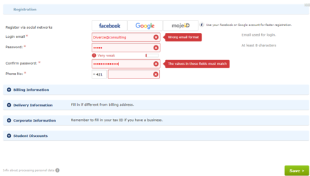
Here are the interventions highlighted:

"Expecting errors" is a type of nudging principle that helps improve customer decision-making. It's simple: anticipate where the customer might go wrong and prepare a "nudge" or, in other words, a "gentle push" – for example, displaying a description or message that guides them in the right direction.
We filled out everything and purchased the phone. There are three main ways it can reach you: home delivery, self-service at a local secure box at the selected location, or picking it up in person at a physical store. Offering options helps you create a customized environment that best suits your customers' needs. I chose to pick it up at a physical store.
The synchronization between the physical store and your e-shop is also extremely important. So, in the last section, we will talk about that.
6. Pickup Of Goods
a) Journey To The Branch
After placing the order, the final step is picking up the goods. We decided to pick up our order at the Alza headquarters in Bratislava. See how simple the pickup process is.
Just as in the online world, Alza uses the method of least resistance in behavioral solutions to facilitate a person's journey from point A (desire to buy the product) to point B (payment for the selected product), a similar method is employed in the offline world.
This method is called intuitive coding. Intuitive coding is a bit more complex, but its essence is to physically guide a person from point A to point B without much thought, allowing them to navigate using System 1, the automatic and intuitive system in their brain.
When you enter the building, a panel providing additional instructions is placed right in the middle. It's positioned in a way that makes it unmissable; it literally blocks your way. This is the Placement method.

This method is usually done by observing the path most customers commonly take and placing the relevant item there to interrupt their movement and draw attention to it.
Also, notice the simple instructions displayed on the top right. Alza "bombards" you with instructions right from the start. Sometimes, you might feel like you're at an airport.
If you continue your journey to pick up your goods, you'll notice that you need to go to the 1st floor. There are stairs leading you there, assuring you that you're going the right way. (And yes I roamed around Alza with my phone and took pictures just for this case study).

You know exactly where to go. The only thing missing is arrows on the floor after you climb the stairs. That's a very effective way to guide people. Fortunately, there are boards upstairs, but arrows on the floor would have a better effect behavioral effect but worse from a design POV. Got to pick your poison.
The space where you need to pay looks something like this.

The best thing I saw for the first time only at Alza is that the order code they send to your mobile has the same length as your phone number, so you can choose which one to enter - I chose my mobile number of course. This is more than brilliant, especially for those of us who have a million things on our minds and forget everything, well, like me. Again, a brilliantly used "Expect errors" method we discussed earlier. Everything is simple and clear.
After printing your ticket, you'll return downstairs to wait at the counter. You have to go through the whole branch back and forth on purpose, so you see everything Alza offers. Similar to shopping architecture in supermarkets where they place the most common things people buy all the way to the end.
When you come to the counter there is just one thing. Do you see those icons under the counter?

They are the same icons you see when you want to buy any product in their store. These are signals reminding you of the biggest benefits of buying at Alza so you don't forget or would rather pay extra for them. Offline upselling while waiting.
For example, while sitting and waiting for your goods, you constantly look at theft insurance, as you have enough time to think about it. Thoughts about someone stealing from you or your phone easily breaking start emerging in your mind the longer you wait. Doubts grow larger over time until you finally decide to eliminate them and purchase this security "just in case." Anyway, after a while, the staff came, handed us the product, and we left as happy and satisfied Alza customers!
b) Create An Unforgettable Unboxing Experience
With the growing user-generated content and digital recommendations, the unboxing phenomenon has quickly become a part of our lives. Apple likely popularized this trend by paying great attention to how products are packaged. It's no coincidence that there are currently YouTube channels dedicated to unboxing various products with over 16 million subscribers.
Consumers and retailers alike love unboxing videos because they help consumers gain detailed insights into the products they are interested in. For marketers, this translates to social approval and broader reach.
If you want to create an irresistible unboxing experience for your customers, you need to set their expectations right from the start. Man Crates does this well by already enticing you with the unboxing experience. When you enter your ZIP code on one of their product pages, the company provides you with an estimated delivery date:

This is an example of hyperbolic discounting, which we discussed in the section on night-time pickup, explaining people's tendency to choose smaller immediate rewards over larger, delayed rewards. Moreover, Man Crates provides you with additional information about when your package will be delivered (reducing uncertainties):
During the checkout process, they also allow you to write a gift note to enhance the recipient's unboxing experience. Even better, they suggest several fun pre-written notes for you to choose from:
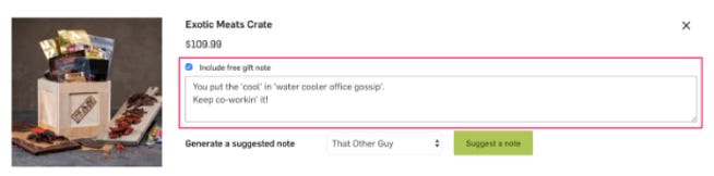
Their crates not only come with a fun note...

... but also with a message encouraging you to record this unboxing process and share your unboxing experiences on social networks.
To encourage even more people to take action, you can offer your customers a special discount on their next purchase in exchange for sharing their unboxing moments.
Another example is at the end of the Sunski box...

... is a humorous note that also communicates the values:

Voilà, we're at the end! Congratulations, and I’m delighted you successfully navigated this journey with us.

7. Too Big to Fall
As with most rapidly growing companies, problems often arise, and Alza is no exception. Recently, there have been reports circulating online, and I've heard from my acquaintances that handling complaints and issues has become a nightmare. Some individuals have even resorted to writing blogs to be heard.
This is not the first nor the last company to face such challenges. I believe that at the end of the day, Alza will survive, especially given the market segment it operates in and the customer base it has. However, many companies might not survive such issues. Dell, for instance, faced significant problems with customer experience, nearly bringing the company down. The CEO had to intervene and overhaul the entire process.

Therefore, this is another issue that Alza will have to address.
Thank you for your attention & time!
- Peter
If the way I approach things resonates — or if your product, idea, or strategy feels even slightly “off” — I might be able to help.
Let’s have a quick 20-minute call to find clarity together:
Very interesting! Cheers