

How to Create Campaigns, Discounts & more, in E-commerce, Targeting Subconsciousness
Create intuitive products & generate content in synergy with functions of the brain, present prices correctly, and learn to take into consideration that each element has its significance.


After a longer break and a somewhat turbulent period, I am returning to writing.
My first article set the bar very high, and I don't think I'll be able to write a similar in-depth analysis anytime soon. Initially, it took me about 3 weeks of full-time work to write Alza's case study, which you can read here.
And I don't have that much time anymore. However, what I definitely try to maintain is the quality of the content.
The purpose of these articles is not to provide you with a short, easy read that you quickly go through with your morning coffee or on your way to work. The goal should be to provide you with materials that serve as a guide or aid in creating your own project. I'll be glad if you save this article and come back to it when you need to.
So let's get into it. As always, I'll be looking forward to hearing your feedback and insights.
What you can look forward to:
Why Should You Actually Be Interested in This Topic?
Why do discounts actually work on us and will always work?
What to Consider When Building E-commerce Strategies Based on Behavioral Principles
Create product content and advertisements on the website in synergy with how the brain functions
2 basic techniques to create intuitive solutions or products
Intuitive coding
Compatibility of stimulus-response
How to create and communicate discounts
An example of how not to do it
Every color has its place, every element has its meaning
Conclusion
1. Why Should You Actually Be Interested In This Topic?
In today's era of immense competition and endless stimuli in the market, companies must value our attention and understand the importance of aspects such as "UI" (user interface) and "UX" (user experience).
These are approaches that improve the customer experience, for example, by making solutions like websites or mobile applications simpler and more user-friendly.
However, many people forget about the foundations on which these solutions should be built. For the majority of them to be useful, they must be rooted in behavioral fundamentals.
My intention in writing this article was to offer a perspective on creating actions and strategies in e-commerce from a slightly different angle than is typically described in articles on the internet.
Let's look at how to create and communicate various events, discounts, promotions, sales, or benefits in a way that is based on behavioral principles and therefore targets our subconscious.
I will focus on e-shops or e-commerce, but these strategies can also be applied in product development.
Before we delve into the specific strategies, I would like to start with a question:
Why do discounts actually work on us and will always work?
Do you ever think about how many times you've bought something just because it was on sale?
We're wired to subconsciously react to various discounts and sales.
Ryan Howell, a psychology professor at the University of San Francisco, says, "The impulse to buy is part of the survival instinct. In hunter-gatherer times, if you saw something, you had to take it because you might not see it again. So this impulse partly explains impulse buying."
Perhaps the best example is the atmosphere of "Black Friday," which we see not only in America but now all over the world. Black Friday discounts lure many people into stores, and they then shop blindly for everything in sight.

Sales and promotions with a specific theme (like Black Friday or autumn sales) give us the feeling that a particular item will soon be unavailable. Whether due to stock depletion or the imminent release of a new collection.
From behavioral economics, we know several cognitive principles associated with this "irrational" behavior:
Scarcity – The scarcity of something creates the impression that it's better, more valuable, or more precious.
Loss aversion – People tend to act irrationally even with small losses because they fear them: of property, love, friendship, dominance, opportunity, or anything valuable.
FOMO/Fear of missing out – The ubiquitous fear that others may have great experiences from an event, product, or promotion that you miss out on.
Discounts have a strong impact on our shopping impulses, not only during events like Black Friday. One could say that it all induces an evolutionary panic in us – the fear of missing out on something great. Sales and promotions, especially thematic ones like Black Friday, make us feel that these items are out of reach.
It's precisely marketing strategies based on psychological principles that continue to succeed because they effectively resonate with our natural instincts and psychological reactions.
In this blog, we'll explore how to successfully build a website (e-commerce) with an emphasis on behavioral and psychological aspects. Are you ready?
2. What to Consider When Building E-commerce Strategies Based on Behavioral Principles
Let's look at several fundamental strategies and areas that every e-commerce business must address, such as creating product content and advertisements on the website, communicating discounts, setting pricing, or working with colors and elements as keys to reducing cognitive load and thus improving the customer experience.
We'll show you how to incorporate insights from behavioral sciences into the development of these strategies.
Create Product Content and Advertisements on the Website in Synergy with How the Brain Functions
People use two forms of thinking that they regularly switch between - automatic and logical.
This finding was first articulated by Kahneman and Tversky, who detailed it in their book "Thinking, Fast and Slow."
In everyday life, people are constantly making decisions and taking action. Most activities and reactions are automatic and intuitive, but some require deliberate effort, reflection, or focused thinking.
According to Kahneman and Tversky, fast, automatic, intuitive thinking and acting is a matter of System 1 (S1), while deliberate, slower, demanding, and tiring thinking is a matter of System 2 (S2).

A common piece of advice I often hear is for people to focus on creating things that are primarily intuitive, easy, and improve the customer experience because customers are bombarded with too many stimuli every day and don't have time to figure out how things work.
And mainly because we live in a world where attention has become currency, and it's crucial to know how to capture it. If we don't capture someone's attention, we don't get the opportunity to convert them into a purchase.
But that's just the first part of the puzzle. Attention and interest alone don't make sales.
Once we've captured a customer's interest in our product, then comes the sales phase, where the second form of thinking dominates - the logical one.
We need to stimulate the customer's logical part of the brain as well. "Clickbait" headlines, articles, or even product descriptions usually don't sell products.
Even marketing wizard David Ogilvy pointed out the same thing in his famous quote:
"The customer is not a moron, she's your wife."
What he basically meant was:
"Ogilvy made his remark in response to the typical advertising practices of the early 1950s, which were characterized by loud and hectoring voices and shamelessly exaggerated print. He believed that ads should be delivered in a softer and more sympathetic tone, treating the customer as intelligent and capable of seeing through the baloney.
Other advertisers have since used this quotation as a reminder that advertisers shouldn't patronize or doubt the intelligence of their customers because it can harm their business."
How can we combine these two types of thinking to bring the greatest benefits to our business?
These are the basic areas that positively influence and address System 1:

And these address System 2:

And how can we easily combine them?
What could it look like in a real example?
Start with a bold emotional headline and a captivating image or video of your product.
Below, add compelling evidence that other people also love it and support it with statements that purchasing such a product is very straightforward.
Finally, provide detailed information, logical arguments, and additional resources about the product that people can read if they're interested, or offer the option to contact your specialist for this type of product.
So, whenever you create any section on your website, keep in mind whether you're addressing both parts of the brain.
2 Basic Techniques to Create Intuitive Solutions or Products
In the previous section, we discussed why it's essential to consider the two modes of thinking when creating advertisements. This part will be very general, shorter, and more theoretical, but I want to address techniques, or rather behavioral insights, that help me in my everyday work, and I constantly keep them in mind when creating any solution.
My intention is to briefly introduce, explain, and show simple examples of these techniques. Then it's up to you how you use them because there are indeed many ways.
As I mentioned in the previous section, the brain usually operates in System 1, and to communicate effectively with this system, we have techniques that we use in behavioral interventions.
Intuitive Coding.
Intuitive coding refers to the construction of information, environment, and objects in a way that intuitive automatic processes (System 1 thinking) lead to the formation of correct beliefs and behavior.
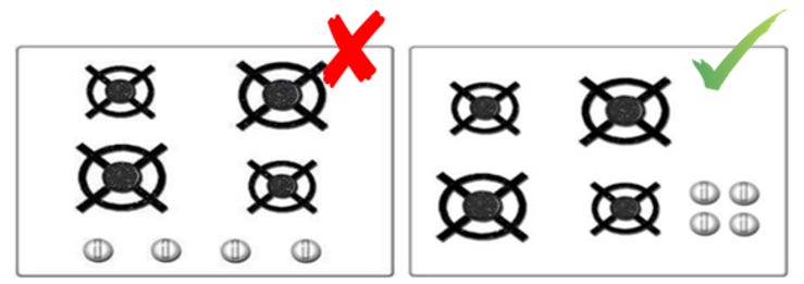
It's best illustrated with a specific example.
Below are two designs of a kitchen stove, and it's easy to say which design is easier for a human to understand. The one on the right has buttons arranged the same way as the system design it controls.
Every time I create a product or a webpage, I imagine how a person will use them and where they might make a mistake. Just going through this exercise with myself helps me eliminate most bad design elements.
I mainly use this when creating a webpage, checking whether a solution is intuitive.
Here's a real-life example from a client's product. They had a great solution, but their application was very non-intuitive.
Their product was creating your digital twin based on artificial intelligence. So, you could upload "your brain" into the application through gamification.
When you registered, you landed on a screen like this:
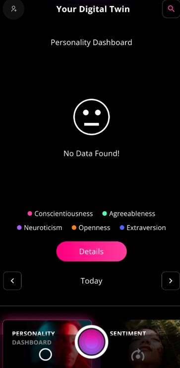
You land on a screen with lots of stimuli, and right in the middle of the screen, the text "data not found" appears. If you click on that text, which intuitively comes to everyone's mind, nothing happens. If you click on "details," which is the most highlighted button, intuitively guiding you there, it takes you to a part of the application where again, no data is found.
You don't understand what to do because all the intuitive actions you've learned from other applications, like clicking on text or a large button, lead you in the wrong direction or completely confuse you.
It's essential to always consider the established rules and not change them forcibly, and if you do change them, make sure it's extremely deliberate. So if I place, for example, a large button somewhere on the webpage, it should lead me to the beginning of the customer journey, in this case, to input my digital self-data.
Compatibility of Stimulus-Response.
Another thing that directly relates to the technique of intuitive coding is maintaining the compatibility of stimulus-response. The compatibility of stimulus-response is a fundamental psychological principle that says the signal to be received (stimulus) must be in line with the desired action (response). When the signal and the desire are in opposition, performance suffers, and people make mistakes.
In other words, it's essential to consider what a particular color, element, or solution generally signals and whether it aligns with what you want to convey to people.
Still too complicated? I understand. Let's go through examples instead.
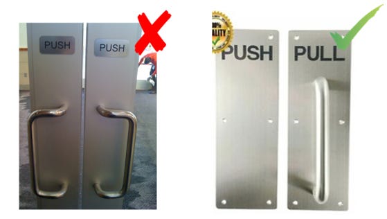
In the image below, we see a solution for a door-opening system. If you put a doorknob on the door, the first tendency of people is to pull, and it doesn't matter what you write there because most people don't read it. For example, if you want people to push the door, you need to leave it empty (without a doorknob), as shown in the image on the right.
Thanks to this exercise, we once identified a problem in the client's application before it went into development.
What happened?
The corporate colors of the client were red and white, and it was necessary to adhere to them.
The problem was that generally, red means "No/Prohibited":

⚠️ This post will be clipped in your email soon. Click here to continue reading. ⚠️
Therefore, the buttons in the application had to be red:

But having red as the pay button wasn't ideal either. The biggest problem, however, was during payment when users were sometimes shown two buttons - a red one, which had "pay" in small letters inside, and a gray one, which served to display more information:

It confirmed what we suspected: when people got to the payment screen, they always hesitated, didn't like it, or unnecessarily clicked on the gray button for more information, even if they didn't need it.
In the end, I had to propose a different solution, which was for users to pay through a swipe button that changed color when swiped to the right, vibrated, and made a subtle sound that acted as a positive stimulus that you've correctly performed the desired action.

And people really liked it.
I was inspired by Apple's well-known solution used when unlocking the phone.

Be aware, not only providing the wrong stimuli can cost you a lot, but you also need to make sure you don't give people too many stimuli that they won't know what to do and subsequently perform a different action than the one you originally intended.
Just like when creating a Digital AI Twin in the mentioned application above, where there were a lot of stimuli and it was unclear where to click first:
And I highlighted only the main stimuli in the image above. There are many more stimuli where you can click.
So it's important to pay attention to whether your stimuli inadvertently communicate something else than the original goal, or whether there are too many of them.
We use these techniques to ensure that everything on the website is set up so that people understand it automatically without much thinking. In today's world with short attention spans and limited patience, a website visitor will leave if they don't understand something immediately or if they don't quickly find what they came for.
How to Create and Communicate Discounts
Now let's specifically focus on the strategy of communicating all the benefits such as discounts, sales, and promotions that an e-commerce offers.
Firstly, it's important that each promotion or discount is very easily and immediately distinguishable.
This is done using the Salience method and by creating Associations.
Salience.
It's a state or quality that stands out from its neighbors. Detecting "salience" is considered a key attention mechanism that facilitates learning and survival by allowing organisms to focus their limited perception and cognitive resources on the most relevant subsets of available sensory data.
Take a look at the image below and try to think about which hamster grabs your attention the most.

I assume the pink one.
This principle was the basis for the entire concept described in Seth Godin's book "Purple Cow", where Seth says:
"For a company to survive in the modern business world, it needs to have a purple cow - that is, a remarkable idea, product, or service that sets it apart from the competition. Purple cows and remarkable ideas stand out, and people talk about them."
However, we can apply this principle much more simply, for highlighting advertisements or individual products, and we'll talk about that below.
Salience is a very effective tool that we have in our behavioral library, borrowed from neuroscience, and when used correctly, it can yield great results.
Association.
It's in psychology and philosophy the involuntary grouping of elements of the psyche, between which a connection was created by the preceding act of the mind. Thanks to association, the appearance of one element in certain conditions evokes another, related element.
I believe everyone is familiar with the principle of associations. For example, if I ask which drink gives you wings, most people will say Red Bull, or:

So how can you use the principles of Salience and Associations in e-commerce?
Let's look at examples from top players in their field such as Alza (the best e-commerce in the consumer category) and BUBO (the best travel agency in the country) or Aboutyou (one of the best fashion e-commerce).
The first step is to create a stimulus that clearly communicates discounts or promotions. It can be a sign, color, element, or shape that significantly stands out from the color palette of the page.
In the case of discounts, the color red is often used, but what is primarily important is for the color to significantly differ from the main color scheme of the page/brand, otherwise, it could lead to confusion among visitors.
Note: It's not just about colors, but about creating associations and subsequently distinguishing products.
For example, Aboutyou does this very elegantly. At the top of the page, it displays a red bar with a countdown, alerting to a sale, thus creating an association that red = sale.

Subsequently, in the individual product architecture, we see a red rectangle on the left side indicating the temporary discount (salience), and the number is also in red.

In this case, I tried to show another thing as well. Below the red rectangle is an orange one, also indicating a discount:

Here you can nicely see how Aboutyou simply distinguishes discounts. So, red is for the temporary big sale and orange is for the regular seasonal discount.
Most e-shops never do such things.
For BUBO, for example, it's a red square with an icon:

which communicates discounts, and a yellow square, which communicates last-minute deals:

You see when you look at it from a distance, you can immediately determine which offers are on sale or last minute:

In the case of Alza, it's the yellow color or a yellow rectangle indicating product offers:

And you can see it immediately on their product page:

For unique promotions, they also have a unique coloring, such as black-yellow, in the case of Black Friday promotions.

But even before Alza created such a unique type of discount that is completely new, they left nothing to chance and aligned the communication and graphics on the page to further stimulate the desired association.
Take a look below at the overall design of the page:
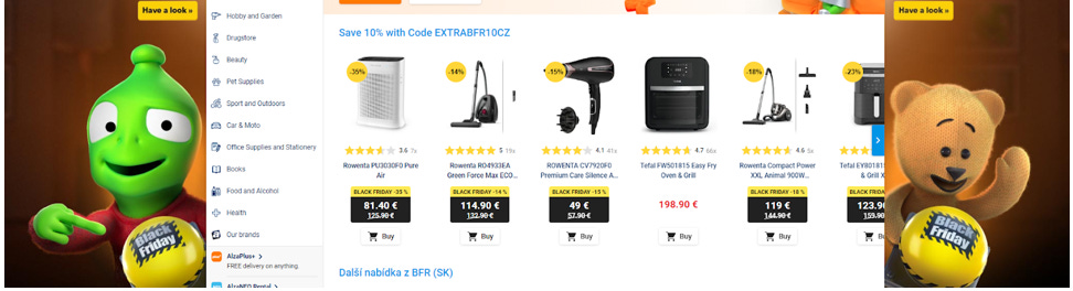
They even gave the mascot such buttons,

which design-wise look the same as the discounts on the products:

Thanks to the creation of these associations, we can then easily apply the Salience method mentioned above, and you immediately know what is on sale for Black Friday and what is not:

Your task should be to "grab" the consumer's attention and direct their focus to a specific event. You achieve this by creating consistent architectures for individual products, where you insert a symbol on which you previously created an association in communication and which, even in its smaller size, significantly distinguishes the product from the whole and thus attracts the consumer's attention.
A properly created visualization considering the principles of salience and associations also allows us to place products on sale among products that are not on sale.
Many e-shops separate these products, with the sale having its own section:

However, in this case, you're losing one of the biggest advantages.
For example, many people specifically look for sales, so they directly visit the Sale subpage instead of browsing through other products.
You're reducing your chances of purchasing other products.
Why do you think supermarkets place items you buy most often, such as bread, at the back of the store?
To make you go through the entire store and see as many products as possible before you get to the most important one. Since we're impulsive creatures, there's a huge chance we'll add something we didn't originally need along the way.
Example of How Not to Do It
Many e-shops make the mistake of improperly communicating discounts. Many promotions, where the consumer sees a product on sale, but cannot automatically associate it with a specific promotion, become irrelevant. In that case, the discounts become meaningless.
Let's look at this example. Below, we see different types of promotions on one e-shop:

And this is how the product looks:
Note for English speakers Vypredaj = Sale

Here, we can see that the person has no idea what the discount is, when it ends, or why it's on sale. If we don't have a clear reason for the promotion that we can easily and immediately connect with, it creates subconscious distrust, and the benefits of discounts are lost. People get the feeling that such sales are always there.
For the consumer, it feels like a standard strategy the seller is using to lure them in.
If I put all these promotions together, as seen in the image below, the sale is most associated with the discount on the first purchase, because they are most similar in color:

In the other banners, the discounts are divided into categories, the first one ranging from 20-50% and the second one 15%. Even the amounts don't indicate the percentage size of the discount, so there isn't even the smallest indicator for the consumer to identify what the promotion actually is.

This is an example of a very ineffective promotion strategy.
How to Communicate Prices and What Their Significance Should Be
Once we've established a good discount strategy and communication of benefits, which I hope you now understand, we should correctly set prices. Pricing is a very challenging matter in itself. However, I'll briefly focus on the behavioral aspect of this process, which should be more like the cherry on top rather than considered a pricing strategy.
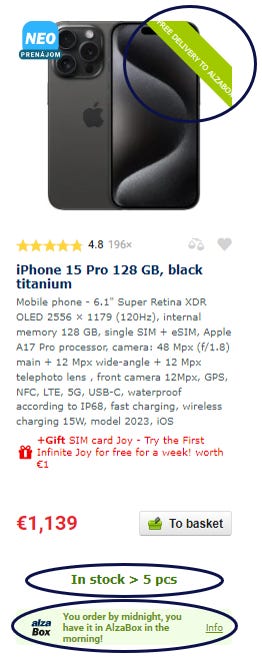
In this case, Alza has quite an interesting approach:

The largest displayed amount is the discounted price, the lowest possible amount (excluding VAT, as it applies to businesses).
Besides capturing attention, pricing also utilizes a technique called anchoring.
Anchoring: People typically rely on the first information they receive when making decisions, regardless of how reliable that information is. The very first information has a huge impact on our brains.
As mentioned with anchoring, the first information has a significant impact. Therefore, I believe Alza, for example, should increase the previous price but still keep it at the top.
However, you must not forget the style in which you display the price. If you want the amount to fully serve its purpose, you need to show the price before the discount, after the discount, and excluding VAT (if necessary for businesses).
Of course, we can't forget about percentage representation either. This activates the so-called comparison effect.
Comparison Bias: People tend to make decisions based on the comparison.

Here, I see room for a small improvement by Alza: adding the price difference in absolute value to the percentage discount, highlighting how much customers actually save.
This works best in cases where the difference is significant. If it's not in the initial product architecture, it should at least be shown after opening the product. For example, the way TopSki, the largest ski equipment retailer, does it:

Communicating the overall savings is important mainly due to people's inability to immediately calculate the discount or how much they'll actually save. If they want to remember the difference, they have to calculate it in their head, constantly think about it, and keep it in mind. It's not automatic or natural for us.
Why?
I'll give you an example.
Thanks to evolution, we have the ability to immediately recognize facial expressions. If I show you the picture below, you can tell what mood this woman is likely in:

On the other hand, if I ask you to calculate 23x34=, it will take some time, just like when I tell you that you have a 22% discount.
You can't immediately imagine how much you've saved, or it will take a while. This is called Ratio Bias.
Ratio Bias: People find ratios or proportions harder to deal with than absolute numbers or comparisons.
This is because our experiential system—unlike the rational system—encodes information as concrete representations, and absolute numbers are more concrete than ratios or percentages.
Physically writing the sentence "save €35" helps people to better visualize it and they'll be more inclined to spend this money in the e-shop on accessories of equal value than if they were just pleased to have saved 22%.

Every Color Has Its Place, Every Element Has Its Meaning
For some, it might seem like a small detail, but for good designers, it's fundamental to their work.
I'll never forget the advice I received at the beginning of my career from a colleague who studied design. It was advice about working with colors.
I started working at KPMG in the Transaction Department, and we had to prepare a presentation for a client. I tried to make the presentation look as good as possible, so I used a large number of colors without much consideration.
He sat me down and explained to me that every color I use must have a purpose and automatically create an association. For example, if I used green for country A, I shouldn't use that color anywhere else in the presentation, only for elements related to country A.
This fundamentally changed my perspective and instilled in me a desire to pay attention to every detail, and it has stayed with me to this day.
So, let's go back; in this section, we'll focus on the communication and significance of colors. How to set up the right strategies to communicate directly with the human subconscious. And, above all, we'll complete the last piece of our strategy.
Again, we'll use the behavioral principles mentioned earlier, such as intuitive coding, compatibility of stimulus-response, and associations.
First and foremost, it's important to remember that all strategies and interventions must have the same color.
For example, if we're communicating free shipping, everything related to it should be the same color.
Amazon also uses the same color for details like the item number in the basket and the purchase button:

Alza, on the other hand, uses green for everything related to shipping, like delivery speed, basket, and stock levels:
This means that if shipping is marked in green, everything related to shipping or moving goods should also be green.
If the discount is red, then everything related to it should be red.
This way, you reduce chaos on the page, better communicate discounts, and build a consistent brand.
The same applies to amounts, which should either be the same color as the communicated discounts on the page (as explained earlier) or should be marked in red, which is generally known as the color for discounts.
Many e-shops, especially smaller ones, when communicating a temporary promotion, leave the discounted amount in black and the previous amount in gray:
This completely negates the effect it's supposed to have.
People don't automatically associate that price with the discount or promotion, so all the principles described above, which contribute to increased expression, are pointless. People think it's just a regular discount that will be there for a long time.
Not to mention that this way, the page is limited to only one discount at a time, so they shouldn't use multiple promotions.
For example, Alza found a way to separate multiple promotions from each other. Each has a slightly different overall design.
For example, this is the design for clearance discounts:
This is what product promotions look like:

And this is what Black Friday looks like:
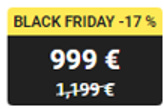
In comparison to what the amount looks like without a unique promotion, just purely on sale:

And when you put them all side by side, you can clearly distinguish the promotions:

I think this is a beautiful conclusion to what I've been trying to communicate throughout the entire article. The main message is that every element, color, and everything used on the page should be thoughtful and carry a deeper meaning.
If the way I approach things resonates — or if your product, idea, or strategy feels even slightly “off” — I might be able to help.
Let’s have a quick 20-minute call to find clarity together:
3. Conclusion
For many, these things may seem like trivialities, but it's precisely these details that matter in today's world of hyper-competition and the multitude of e-shops.
The faster a customer understands your website, the easier it is to navigate, the more pleasant the experience, and the higher the chance of making a purchase. And not only that, but when they make a purchase, there's also a greater likelihood of them returning to buy again.
Today, building an e-commerce business doesn't cost as much money as it used to, which in turn leads to intense competition. Therefore, behavioral insights, knowledge about human behavior, decision-making processes, and consumer psychology become crucial.
They not only help in providing exceptional services but also lay the best foundations for future innovations.
See you in the next article.
- Peter