

[2/6] Ultimate Guide: Model for Identifying and Changing Behavior - Attention
Attention—the area that everyone is trying to steal from us. The area that everyone is fighting for. In this article, we will show how to approach it and what methods to use to influence it.

Welcome to the second part of our series where we analyze the ABCD Framework, either as a whole or its individual parts.
For those who want to return to the first part, click HERE.
In the last article, we introduced the model as a whole, explained its purpose, showed a few examples, and outlined what we will cover in the upcoming parts.
Just as a reminder, here is the entire model:

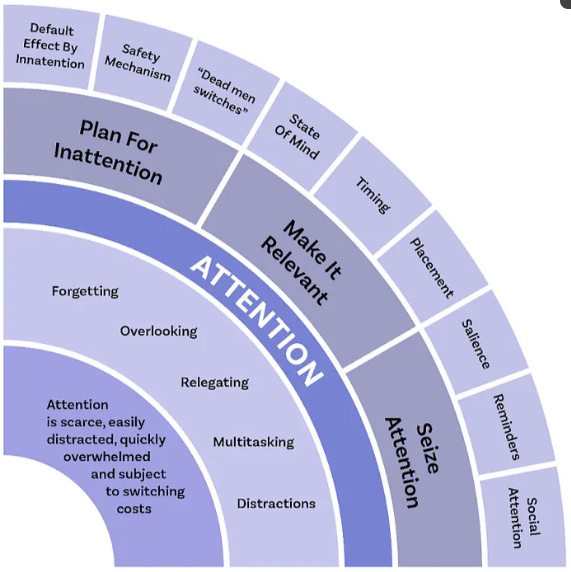
We will focus on the purple part titled “Attention.”
For those who would like to support this effort, you can find the entire study here for a symbolic price. It also includes examples and exercises that you won’t find in the article.
End of general theory—let’s get straight to the good part.
Area: Attention
Attention—the area that everyone is trying to steal from us. It’s the battleground of our modern age. What we focus on—or fail to focus on—has a significant impact on the decisions we make.
However, attention is incredibly fleeting, especially today, where the phenomenon of ADHD (attention deficit hyperactivity disorder) has become widespread. In a world full of social media like TikTok and constant advertisements whose sole purpose is to capture our attention and create addiction, the ability to effectively manage and address this area has become increasingly crucial.
As I mentioned earlier, we can only focus on one thing at a time and pay attention to a limited number of stimuli. Understanding and managing this limitation is key to making better decisions and developing strategies in both personal and professional life.
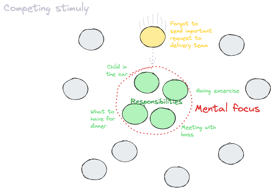
If we shift our attention to a different stimulus, it’s likely that it will be replaced by something more immediate. The primary factors are the urgency and importance of the stimulus. Therefore, it’s essential to work with these two variables and adopt techniques to manage attention effectively.
The main signs of attention problems include:
Forgetting
Overlooking things
Multitasking
Distraction
Let me share a brief example of how I sometimes address the area of attention.
When someone arrives on a client’s website (the same applies when creating a product), I immediately form two hypotheses: either they have a rough idea of what they’re looking for, or they have no clue.
If they know what they’re looking for—for example, they clicked an ad for a “Black Friday” hair care sale—I need to grab and hold their attention. I can achieve this by placing the discounted products at the top of the page or directing them to a section of the site dedicated solely to these discounted items.
If they have no idea what they’re looking for, it’s crucial that the site includes features like search, new arrivals, helpful materials, or a “where to start” section.
One of my favorite bloggers has a similarly well-organized layout:
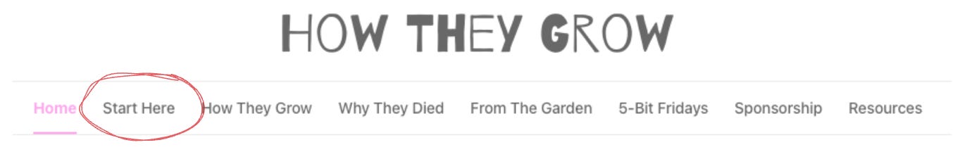
It grabs my attention and the intuitive navigation helps address other behavioral areas at the same time.
The applications of these insights are incredibly broad, and my job is to present them in the simplest way possible for you to understand.
Let’s break them down in detail, one by one—you’ve got a lot to look forward to!
Plan For Inattention
Default Effect By Inattention
Safety Mechanism
“Dead men switches”
Make It Relevant
State Of Mind
Timing
Placement
Seize Attention
Salience
Reminders
Social Attention
1. Plan For Inattention
Ironically, let’s start from the opposite end. When building solutions, people usually focus on how the product should work, emphasizing positive customer journeys and experiences.
However, when it comes to considering what could go wrong, it’s often addressed only superficially.
Example from practice:
If something unexpected happens on a website you’re browsing, you’ll usually encounter a simple error page with basic text, or worse, the device may shut down or restart.

Very few people view these “failure scenarios” as great opportunities, even though they can significantly contribute to a positive customer experience.
Recently, I came across a startup that helps turn error pages into opportunities to continue the customer journey. Their product can identify what you were trying to do before the error occurred and then suggest similar articles or options.
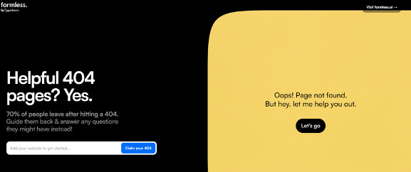
Surprisingly, it’s still rare for people to sit down, look at the solution they’re planning, and carefully consider all the potential scenarios of what could go wrong or how users might misuse it. I’m always amazed by how few people, even in product development, regularly ask themselves the simple question: “What if…?”
In this section, we’ll cover 3 fundamental techniques to address this:
The default effect of inattention
Safety mechanisms
Failure recovery mechanisms
By focusing on these, you can preemptively address issues and turn potential failures into opportunities to improve the overall user experience.
a) Default Effect By Inattention
A default option is defined as an aspect of choice architecture where one specific option is preselected as the default, meaning people have to actively decide to choose an alternative. In other words, the default is what happens when people don’t make a choice.
When designing any solution—whether it’s a system, app, or software—it’s important to always implement a feature that accounts for customer inattention. This addresses situations where the customer, for any reason, stops their activity mid-process.
For example, banking apps automatically log you out after a few minutes of inactivity or when your phone screen locks, ensuring no one else can use your account. Phones lock themselves to save battery and enhance security.
Netflix asks if you’re still watching, while Tesla prompts you to touch the steering wheel regularly when using autopilot.

b) Safety Mechanism
In some cases, the consequences of inattention can be mitigated by physical mechanisms that function similarly to standard architectural settings in procedures. These physical arrangements are often referred to as safety mechanisms, which are distinct from default settings.
As humans, we are prone to errors and imperfections, so every product or service should incorporate some type of safety mechanism to prevent serious consequences due to misuse.
Your task is to consider all the ways improper use, caused by inattention or clumsiness, could cause harm and find ways to prevent that.
For instance, think about what happens when a car crashes or someone inserts a metal object into an electrical socket. The goal is to design mechanisms that prevent or mitigate such outcomes.
Let’s take a more trivial example: how many times has someone accidentally tripped over a charging cable, causing electronics—most commonly a laptop—to crash to the floor, resulting in significant damage? It’s happened to me, and to many people I know.
This is why Apple developed MagSafe, a magnetic charging connector.

So when I trip, nothing happens

Not like with the Windows….

To some, these details may seem trivial, but such small improvements can dramatically enhance the customer experience. These are the solutions that win, and when these small features add up, they create something truly remarkable.
Another, more curious example comes from Japan. A large number of people were falling onto train tracks at stations. Initially, officials believed they were attempting suicide, but after installing cameras, they discovered that station chairs were positioned facing directly toward the tracks. When intoxicated individuals tried to stand up, they would often stumble onto the tracks. In Japanese culture, where drinking is common but alcohol tolerance is low, simply turning the chairs away from the tracks significantly reduced the number of people falling under trains.

This concept isn’t limited to hardware—it applies to software as well. A good example is the option to cancel a sent message within a few seconds, in case you send something by mistake. Or automatic file backups in programs like Microsoft Word, which save your progress in case of a computer crash.
Who hasn’t experienced the frustration of losing hours of work because an unexpected computer restart for a “very important” software update wiped it out?
And this leads us to our final technique, closely related: dead men switches.
c) “Dead men switches” (“failure recovery mechanisms”)
Default settings are ubiquitous and have a powerful influence. You can’t avoid them because every node in a choice architecture system must have a rule that defines what happens if the decision-maker does nothing or fails to perform the required behavior, potentially leading to disaster.
The phrase “leading to disaster” plays a key role here. In this case, you must think about so-called “dead man switches.”
All these interventions I’m describing are similar; we’re just looking at them from different angles. “Dead man switches” are typically implemented in situations where the user is actively engaged with a product but either doesn’t perform the required action or makes an incorrect action, which could have serious consequences. These mechanisms ensure that if the user doesn’t respond or act as expected, the system will take predefined actions.
While this may seem a bit abstract, here are a few examples from very different fields:
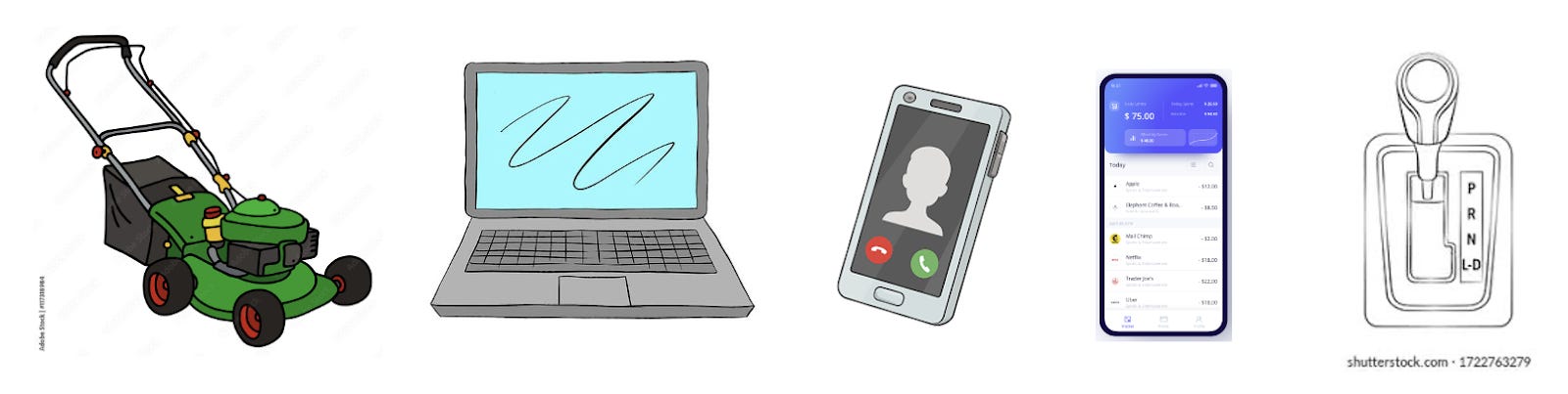
Lawnmowers: To keep the mower moving, you must constantly hold a secondary handlebar lever. If you let go, the mower stops.
Laptops: If you don’t shut down your laptop, it automatically enters sleep mode to conserve energy.
Phone calls: If a call lasts more than an hour, it automatically disconnects to avoid system overload or charges.
Banking apps: If you turn off your phone screen while using the app, it automatically logs you out to protect your data.
Car ignition: If the car is in gear, the engine won’t start, preventing accidents or damage.
This area focuses on approaching things from the opposite angle—from the “other side.” Instead of simply ensuring the problem is addressed, aim to address it as creatively as possible. This approach can dramatically improve the customer experience with your product and help you stand out from the competition.
With that, we wrap up this section. Let’s move on to the next one!
2. Make It Relevant
I probably don’t need to emphasize the critical role of relevance, as it’s the cornerstone of the phenomenon driving algorithm development for hyper-personalization and delivering relevant content.
Relevance significantly improves all possible metrics we know in the digital world, and failing to maintain it can cost companies dearly.
So, let’s take a look at some techniques we can leverage from a behavioral perspective to ensure relevance and optimize user experiences.
a) State of Mind
State of mind plays a crucial role in how we pay attention and process information. Our mental and emotional state can greatly influence our ability to focus, engage, and retain information.
What state of mind is the person in when they visit your site? What are they expecting? What are they trying to achieve? How do they perceive the page? What emotions might it evoke in them? I aim not just to classify the customer but to empathize with their thought process.
For example, showing up at McDonald’s at 3 a.m. is a completely different mental state than visiting a salad bar at noon on a weekend. The offer should align with the state of mind.
Different customer journeys within the same app can appeal to different mental states. Sending money requires different functions and customer journeys than redeeming rewards in a loyalty program. When making payments, we focus on clarity and security, while in a loyalty program, we prioritize gamification and design. I discuss this more extensively in the introduction of my article on Understanding and Classifying Consumers in the Digital World.
Salespeople should approach customers differently than a department handling complaints and returns.
Conversely, you can create the desired state of mind in your customers. For instance, casinos often lack windows or clocks so that players lose track of time and don’t realize how long they’ve been playing. Similarly, clothing stores use specific luxury scents dispersed throughout the space to extend the time customers spend shopping.
So, either empathize with your customer and tailor your interventions to their current needs, or understand the state of mind they should be in when using your service, and work to create that mindset.
b) Timing
“Right decision, wrong time” – you’ve probably heard statements like this before. Even if you make the right decision or find an effective solution, if it’s done at the wrong time, it’s likely to still be a failure.
I apply this principle to almost every step. When planning various interventions, I always ask myself, “When is the best time to implement this?”
For example, when dealing with ads on e-commerce or other websites, I always consider: When is the best moment to show a pop-up? For products with a specific purpose, I think about when it’s best to ask for feedback or a review. When should I ask for a review? When should I start personalizing the offer for the customer?
Many times, I’ve encountered a situation where, just a few seconds after landing on a page, I’m shown a “personalized offer for me” – even though I’ve barely done anything on the site. Our tests have shown that this premature personalization can significantly reduce the credibility of personalization across the entire site, even in future interactions.
These questions may seem trivial, and of course, you can often get by without asking them. However, I frequently see simple mistakes on websites and products that could be significantly minimized by simply asking these questions. Sometimes, just voicing them out loud can reveal obvious flaws and overlooked details.
One particularly interesting example of timing was a pop-up that appeared when I was about to leave the site.

Source: Optinmonster
Timing is often closely tied to another insight, called “Placement.”
c) Placement
Not only is correct timing important, but proper placement also has a significant impact on the success of any intervention. It’s useful to go through an exercise before implementation and consider where exactly to place an intervention to achieve the best possible effect.
When using pop-up windows or ads, I ask not only when they should appear but also where to place them so they are effective without annoying the user.
If I’m dealing with personalized, new, or discounted products, I again consider where to place them and how to visually distinguish them from the rest.
This method works just as well in everyday life. For example, in HR, they realized that plastering company announcements all over the walls doesn’t work—people won’t read them. Instead, placing them in areas where people spend time, like the break room near the coffee machine, between elevators, or even better, inside restroom stalls, proves much more effective. These are places where people spend a bit of time and are happy to kill it by reading posters.
E-commerce giant Alza, one of the most visited websites with popular physical branches, uses this method by simulating customer movement in-store. For instance, they place information boards right in the middle of the entrance path or place labels on the edge of stairs to catch attention, rather than on the floor, where people often miss them. Additionally, icons about product protection options are placed under the counter where customers wait for their items, effectively encouraging additional purchases and increasing product security.

Condom retailers saw a significant sales increase when they moved the product display from the checkout area to near the alcohol section. This is what you call understanding mindset and proper placement.

On the flip side, a common negative impact can occur when companies want to “do things differently” and unnecessarily innovate by changing the layout or design that people are familiar with. For example, in e-shops, constant changes to site navigation or moving the shopping cart button to a different place, or even changing the design, can lead to confusion and frustration for customers.
These three basic techniques—ensuring relevance, creating the right mindset, timing actions well, and placing them properly—can help you design more effective interventions. There are many techniques to make something relevant, but these were just a few key examples.
Now that we’ve made things relevant, let’s focus on capturing the user’s attention.
3. Seize Attention
Relevance is crucial—without it, people won’t show interest. But once you’ve captured their interest, managing it is like walking on thin ice. With poor interventions, you can quickly fall through—in other words, you can lose the customer’s attention very easily.
In today’s world, with platforms like TikTok and other social media, our ability to maintain attention has drastically decreased. It’s fragile, and handling it requires great care and precision. Even the slightest misstep can result in disengagement, so understanding how to carefully manage and sustain attention is more important than ever.

a) Salience
This principle comes from neuroscience: Salience—also known as perceptual salience—suggests that people focus on more prominent information while ignoring less significant details. It creates a tendency to notice more striking, visible messages, usually due to the high contrast between them. The brain typically detects this contrast instantly and automatically.
Look at the image below, and you’ll see which cow catches your attention:

In today’s world, people often move like zombies, heads down, focused on their phones, barely paying attention to their surroundings. This can be particularly dangerous, especially when crossing streets. In Denmark, they addressed this problem by implementing a glowing line at pedestrian crossings to grab the attention of distracted walkers and improve their safety.

I always start by asking, where is human attention directed, or where do I want to direct it? I try to identify the most important thing I want to communicate while creating some interventions or solutions and then find a way to highlight it—to grab attention.
I ask myself questions like: Can this be done by highlighting the text? Using a different color? Will it blink? Will it have more prominent icons? Or on the contrary, none at all?
Alza, one of the largest e-commerce companies in Central and Eastern Europe, for example, does this by highlighting the product price with clearly distinguishable elements that they want to draw attention to. But such price highlighting, as you can see in the image below, is a great solution. It is not too intrusive, yet sufficiently visible and immediately draws attention to the most important aspect in advantageous offers—the price.

This principle also works well for improving product usability. It’s connected to Hick’s law, which states that “the time it takes to make a decision increases with the number and complexity of choices. If you highlight one option, ensure that other options don’t compete for the user’s attention.”
For instance, Duolingo, the popular language-learning app, grabs users’ attention effectively through notifications reminding them to complete a lesson to avoid losing a streak. However, after gaining that attention, they manage it poorly.
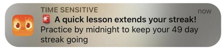
When you click on the notification, it takes you to the main screen, which has too many stimuli vying for attention, significantly increasing the chance that you’ll click elsewhere and get sidetracked—possibly forgetting why you came in the first place.

A simple screen dimming intervention could solve this problem.

You’d be surprised how easily people, especially the elderly or individuals with ADHD (like myself), can be led off course from what was intended for them.
I discuss more about working with colors and associations in my article How to Create Promotions and Discounts in E-commerce That Target the Subconscious.
b) Reminders
This insight is often closely connected with Timing and Placement and is applied at various points throughout the customer journey. I frequently ask questions like, “Does something need to be reminded to the user on this page (for instance, through a pop-up)? If so, what is it?”
Next, I focus on determining the correct Timing and Placement of the reminder, as well as selecting the appropriate method of delivery—whether it’s a pop-up, notification, email, phone call, etc.
Attention can also be captured by simply prompting people to pay attention to important tasks. This is known as forcing a decision by interrupting the user’s current activity and requiring them to make a choice before they can continue. A great example is the pop-up in programs like Microsoft Word, which displays a warning when you try to close a document without saving it.

Many websites also use pop-ups offering discounts just as you’re about to leave the page.
This intervention can be powerful and highly effective, but if misused—such as for spamming users—you risk losing relevance, and people may start ignoring even important notifications.
It’s similar to warning windows that pop up before performing actions with serious consequences, such as deleting an account. If overused or used at the wrong moment, these reminders lose their impact and can frustrate users instead of helping them make informed decisions. The key is balance—using these interventions strategically without overwhelming the user.
c) Social Attention
The ability to capture attention based on the fact that many people are already focused on something is a powerful technique.
Netflix employs this by using salience—creating a category of trending films in a given country, visually distinguishing it from the rest. This immediately draws attention by combining social proof with visual distinctiveness, as mentioned in the previous methods.

This technique is effectively implemented by companies like eBay, where people bid on products, and the highest bidder wins.

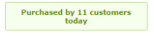
Similarly, it’s often used in e-commerce through labels showing how many people are currently viewing or have already purchased a product.
In fact, this method is key to creating viral content. Something viral doesn’t have to be the best; it just needs to catch a wave of interest and gain massive, temporary attention.
For example, like the Stanley cup, which had been on the market for years but became viral and sold out all over the USA after the owner’s car caught fire with the cup inside. Not only was nothing wrong with the car, but even the water inside was still cold.

What’s funny is that most people who have it now don’t even know about this story and have it because it became popular and they saw it with others.
For example, this individual became an internet sensation overnight with a single viral moment.

You get me?
If the way I approach things resonates — or if your product, idea, or strategy feels even slightly “off” — I might be able to help.
Let’s have a quick 20-minute call to find clarity together:
Conclusion of the Attention Section
We’ve reached the end of this section, the first of four that we will explore. Remember, attention is a critical factor—what has our attention is our highest priority. Ironically, attention is also the easiest to lose among all areas.
So, focus not only on how you capture attention but also on how you maintain and manage it.
In the next section, we’ll dive into Belief Formation, showing how it significantly influences human behavior and what techniques you can use to effectively handle this area.
For those who want to return to the first part, click HERE.
- Peter
For those who would like to support this effort, you can find the entire study here for a symbolic price. It also includes examples and exercises that you won’t find in the article.